Time Series Graphs
In this project, each city’s climate history becomes a graph instead of a simple line chart. Every year of daily temperatures is turned into a node, and edges connect years that behave similarly. This creates a time series graph that captures both how climate changes from one year to the next and how distant years echo each other. A Graph Neural Network then learns a single “fingerprint” for each city-graph, telling us whether its climate pattern looks stable or unstable over the long term.
Once the model learns what “stable” and “unstable” look like, the interesting part begins: we can see which cities behave differently from what their latitude or region would suggest. Some high-latitude coastal cities look surprisingly stable, while others in warmer zones show unexpected instability. These hidden patterns and anomalies highlight places where climate behavior doesn’t fit the usual story and point to regions that may deserve a closer look.
Conference & Publication
The climate time series graph results were first presented at ICANN 2023 in Crete, Greece, on 26–29 September 2023, as Romanova, A. “GNN Graph Classification Method to Discover Climate Change Patterns.” In Artificial Neural Networks and Machine Learning – ICANN 2023, doi: 10.1007/978-3-031-44216-2_32 .
The broader framework that unifies these climate experiments with EEG time series analysis was later presented at COMPLEX NETWORKS 2023 in Menton, France, from 28–30 November 2023, as the paper “Enhancing Time Series Analysis with GNN Graph Classification Models”, published in the conference proceedings, doi: 10.1007/978-3-031-53468-3_3 .
Conference & Publication
This work was presented at ICANN 2023 in Crete, Greece, on 26–29 September 2023, and published as Romanova, A. “GNN Graph Classification Method to Discover Climate Change Patterns.” In Artificial Neural Networks and Machine Learning – ICANN 2023, doi: 10.1007/978-3-031-44216-2_32 .
GNN Graph Classification for Climate Data Analysis
This post represents Graph Neural Network (GNN) graph classification model as a novel method for analyzing stability of temperature patterns over time. Our method involves building graphs based on cosine similarities between daily temperature vectors, training graph classification model and making predictions about temperature stability by graph location.This study highlights GNN graph classifications as powerful tools for analyzing and modeling the complex relationships and dependencies in data that is represented as graphs. They are enabling to uncover hidden patterns, making more accurate predictions and improving the understanding of the Earth's climate.
Introduction
2012 was a breakthrough year for both deep learning and knowledge graph: in 2012 the evolutionary model AlexNet was created and in 2012 Google introduced knowledge graph. Convolutional Neural Network (CNN) image classification techniques demonstrated great success outperforming previous state-of-the-art machine learning techniques in various domains. Knowledge graph became essential as a new era in data integration and data management that drive many products and make them more intelligent and ”magical”.For several years deep learning and knowledge graph were growing in parallel with a gap between them. This gap made it challenging to apply deep learning to graph-structured data and to leverage the strength of both approaches. In the late 2010s, Graph Neural Network (GNN) emerged as a powerful tool for processing graph-structured data and bridged the gap between them.
 (Picture from a book: Bronstein, M., Bruna, J., Cohen, T., and Velickovic ́, P.
“Geometric deep learning: Grids, groups, graphs, geodesics, and gauges”)
(Picture from a book: Bronstein, M., Bruna, J., Cohen, T., and Velickovic ́, P.
“Geometric deep learning: Grids, groups, graphs, geodesics, and gauges”)
CNN and GNN models have a lot in common: both CNN and GNN models are realizations of Geometric Deep Learning. But GNN models are designed specifically for graph-structured data and can leverage the geometric relationships between nodes and combine node features with graph topology. GNN models represent powerful tools for analyzing and modeling the complex relationships and dependencies in data enabling to uncover and understand hidden patterns and making more accurate predictions.
In this post we will investigate how GNN graph classification models can be used to detect abnormal climate change patters. For experiments of this study we will use climate data from kaggle.com data sets: "Temperature History of 1000 cities 1980 to 2020" - average daily temperature data for years 1980 - 2019 for 1000 most populous cities in the world.
To track long-term climate trend and patterns we will start with estimation of average daily temperature for consecutive years. For each city weather station we will calculate sequence of cosines between daily temperature vectors for consecutive years to identify changes in temperature patterns over time. This can be used to understand the effects of climate change and natural variability in weather patterns. Average values of these sequences will show effect of climate change in temperature over time. By tracking these average values, we can identify trends and changes in the temperature patterns and determine how they are related to climate change. A decrease in the average cosine similarity between consecutive years can indicate an increase in the variance or difference in daily temperature patterns, which could be a sign of climate change. On the other hand, an increase in average cosine similarity could indicate a more stable climate with less variance in daily temperature patterns.
To deeper understand the effects of climate change over a longer period of time we will calculate cosine similarity matrices between daily temperature vectors for non-consecutive years. Then by taking vector pairs with a cosine similarity higher than a threshold, we will transform cosine matrices into graph adjacency matrices. These adjacency matrices will represent city graphs that will be used as input into a graph classification model.
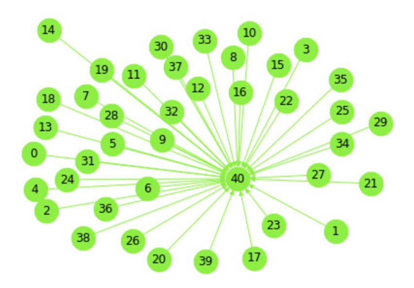
If a city graph produced from the cosine similarity matrix shows high degree of connectivity, it could indicate that the climate patterns in that location are relatively stable over time (Fig. 1), while a city graph with low degree of connectivity may suggest that the climate patterns in that location are more unstable or unpredictable (Fig. 2).
Graph 1: Stable climate in Malaga, Spain represented in graph with high degree of connectivity: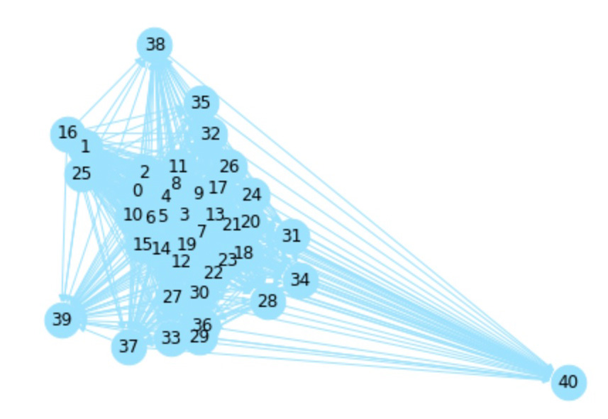 Graph 2: Graph with low degree of connectivity at Orenburg, Russia shows that the climate patterns in that location are unstable and unpredictable:
 City graphs will be used as input to GNN graph classification model that will identify graph classes as stable or unstable to understand how temperature patterns change over time.
In this post we will demonstrate the following:
- Describe related work.
- Describe methods of data preparation, model training and interpreting model results.
- Describe the process of transforming temperature time series to vectors, calculating average values of corresponding sequences of consecutive years, and calculating cosine similarity matrices.
- Describe transformation of cosine similarity matrices to graph adjacency matrices and input data preparation for GNN graph classification model.
- Describe how to train GNN graph classification model.
- Interpret model results by identifying regions that are more vulnerable to climate change and to detect ubnormal climate change patters.
Related Work
GNN graph classification is an emerging area in recent years in GNN architectures, as well as node and graph representations. In GNN architectures effective for graph classification tasks are Graph Convolutional Networks (GCNs), Graph Attention Networks (GATs) and GraphSAGE.In practice GNN graph classification in mostly used for drug discovery and protein function prediction. It can be applied to other areas where data can be represented as graph with graph labels.
Methods
In this post we will describe data processing and model training methods is the following order:- Process of calculating sequences of cosines between daily temperature vectors between consecutive years.
- Process of transforming cosine similarity matrices to graphs.
- Process of training GNN graph classification model.
Cosines between Consecutive Years
To detect abnormal climate change patterns, the first step will be to calculate and analyze the average cosine similarity between consecutive years. This can be done by comparing temperature vectors of each {city, year} and computing average cosine similarities by city. This will give us a general idea of how the temperature patterns are changing over time. The results of this analysis can be used to detect any abnormal climate change patterns and provide valuable insights into the impact of global warming.For cosine similarities we used the following functions:
import torch
def pytorch_cos_sim(a: Tensor, b: Tensor):
    return cos_sim(a, b)
def cos_sim(a: Tensor, b: Tensor):
    if not isinstance(a, torch.Tensor):
        a = torch.tensor(a)
    if not isinstance(b, torch.Tensor):
        b = torch.tensor(b)
    if len(a.shape) == 1:
        a = a.unsqueeze(0)
    if len(b.shape) == 1:
        b = b.unsqueeze(0)
    a_norm = torch.nn.functional.normalize(a, p=2, dim=1)
    b_norm = torch.nn.functional.normalize(b, p=2, dim=1)
return torch.mm(a_norm, b_norm.transpose(0, 1))Cosine Similarity Matrices to Graphs
Next, for each city we will calculate cosine similarity matrices and transform them into graphs by taking only vector pairs with cosine similarities higher than a threshold.
For each graph we will add a virtual node to transform disconnected graphs into single connected components. This process makes it is easier for graph classification models to process and analyze the relationships between nodes. On graph visualizations pictures in Graph1 and Graph2 virtual nodes are represented with number 40 and all nodes for other years with numbers from 0 to 39.
Train the Model
As Graph Neural Networks (GNN) link prediction model we used a GCNConv (Graph Convolutional Network Convolution) model from tutorial of the PyTorch Geometric Library (PyG).
The GCNConv model is a type of graph convolutional network that uses convolution operations to aggregate information from neighboring nodes in a graph. The model is trained on the input graph data, including the edges and node features, and the graph-level labels and it's based on the following input data structure:- Edges: A graph adjacency matrix representing the relationships between the nodes in the graph. In this case, the graph would be the relationships between daily temperature vectors for different years.
- Nodes with embedded features: The node features, such as the average values of the corresponding sequences of consecutive years, would be embedded into the nodes to provide additional information to the GNN graph classification model.
- Labels on graph level: The labels, such as stable or unstable, would be assigned to the graph as a whole, indicating the stability of the temperature patterns over time. These graph-level labels would be used by the GNN graph classification model to make predictions about the stability of the temperature patterns.
Experiments
Data Source
To demonstrate how this methods work we will use climate data from kaggle.com data sets: "Temperature History of 1000 cities 1980 to 2020".This data has average daily temperature in Celsius degrees for years from January 1, 1980 to September 30, 2020 for 1000 most populous cities in the world.
Transform Raw Data to Vectors of Daily Temperature by Year
The raw data of average daily temperature for 1000 cities is represented in 1001 columns - city metadata and average temperature rows for all dates from 1980, January 1 to September 30, 2020.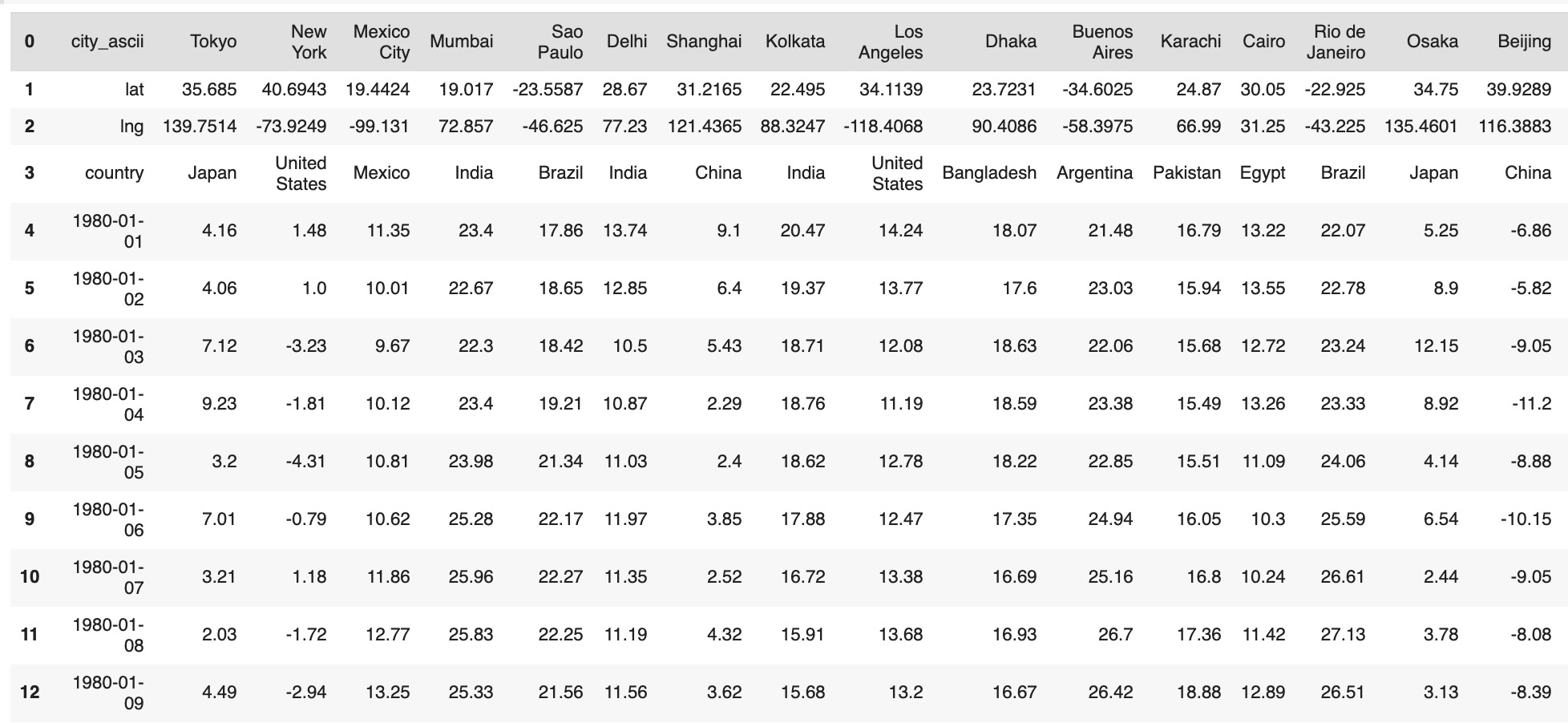 As city metadata we will use the following columns:
- City
- Country
- Latitude
- Longitude
- To get the same data format for each time series from raw data we excluded February 29 rows
- As we had data only until September 30, 2020, we excluded data for year 2020
- From dates formated as 'mm/dd/yyyy' strings we extracted year as 'yyyy' strings
tempCity3=tempCity2[~(tempCity2['metadata'].str.contains("2020-"))]
tempCity4=tempCity3[~(tempCity3['metadata'].str.contains("-02-29"))]
tempCity4['metadata']=tempCity4['metadata'].str.split(r"-",n=0,expand=True)
tempCity4=tempCity4.reset_index(drop=True)- Metadata columns: city, latitude, longitude, country, zone, year
- 365 columns with average daily temperatures
tempCityGroups=tempCity5.groupby(['metadata'])
dataSet=pd.DataFrame()
for x in range(1980, 2020):
  tmpX=tempCityGroups.get_group(str(x)).reset_index(drop=True)
  tmpX=tmpX.drop(tmpX.columns[[0]],axis=1).T
  cityMetadata['year']=x
  cityMetadata.reset_index(drop=True, inplace=True)
  tmpX.reset_index(drop=True, inplace=True)
  df = pd.concat( [cityMetadata, tmpX], axis=1)
  dataSet=dataSet.append(df)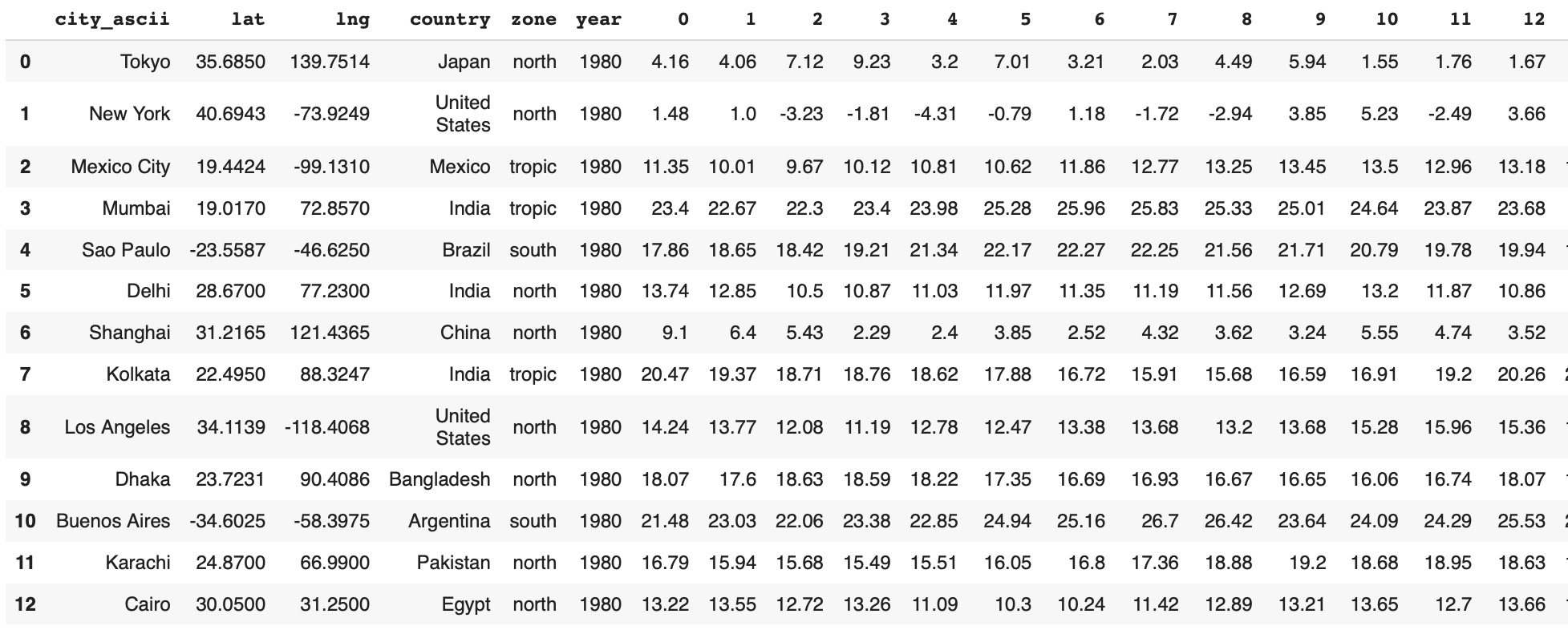
Average Cosines between Consecutive Years.
Calculate cosine sequence {year, year+1} for all cities:cosPairs=[]
for city in range(1000):
cityName=metaCity.iloc[city]['city_ascii']
country=metaCity.iloc[city]['country']
cityIndex=metaCity.iloc[city]['cityInd']
data1=dataSet[(dataSet['cityInd']==city)]
values1=data1.iloc[:,8:373]
fXValues1= values1.fillna(0).values.astype(float)
fXValuesPT1=torch.from_numpy(fXValues1)
cosine_scores1 = pytorch_cos_sim(fXValuesPT1, fXValuesPT1)
for i in range(39):
score=cosine_scores1[i][i+1].detach().numpy()
cosPairs.append({'cityIndex':city,'cityName':cityName, 'country':country,
'score': score})cosPairs_df=pd.DataFrame(cosPairs)
cosAverage=cosPairs_df.groupby(['cityName','country','cityIndex'])['score'].mean().reset_index()
lineScore=cosAverage.sort_values('score').reset_index(drop=True)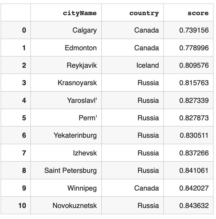
Very high average cosine similarities indicate stable climate with less variance in daily temperature patterns.
Prepare Input Data for GNN Graph Classification Model
Average cosines between consecutive years were used as graph labels for GNN graph classification. The set of graphs was divided in half and marked with stable and unstable labels:
lineScore['label'][lineScore['labelIndex'] > 499] = 0
lineScore['label'][lineScore['labelIndex'] < 500] = 1
lineScore=lineScore[['cityIndex','label']].rename(columns={'cityIndex': 'cityInd'})
lineScore=lineScore[lineScore['label']>=0]subData=dataSet.merge(lineScore,on='cityInd',how='inner')
subData.reset_index(drop=True, inplace=True)metaGroups=subData[(subData['nextYear']==1980)].iloc[:,[1,4,7,374]]
metaGroups.reset_index(drop=True, inplace=True)
metaGroups['index']=metaGroups.index
values1=subData.iloc[:, 9:374]
values1.shape
(40000, 365)- Calculating cosine similarity matrix by cities
- Transforming cosine similarity matries to graph adjacency matrices based on treashold cos=.975
- Transforming data to PyTorch Geometric data format
from torch_geometric.loader import DataLoader
import random
datasetTest=list()
datasetModel=list()
cosList = [0.975]
from torch_geometric.loader import DataLoader
datasetTest=list()
import random
for cos in cosList:
  for g in range(1000):
    cityName=metaGroups.iloc[g]['city_ascii']
    country=metaGroups.iloc[g]['country']
    label=metaGroups.iloc[g]['label']
    cityInd=metaGroups.iloc[g]['cityInd']
    data1=subData[(subData['cityInd']==cityInd)]
    values1=data1.iloc[:, 9:374]
    fXValues1= values1.fillna(0).values.astype(float)
    fXValuesPT1=torch.from_numpy(fXValues1)
    fXValuesPT1avg=torch.mean(fXValuesPT1,dim=0).view(1,-1)
    fXValuesPT1union=torch.cat((fXValuesPT1,fXValuesPT1avg),dim=0)
    cosine_scores1 = pytorch_cos_sim(fXValuesPT1, fXValuesPT1)
    cosPairs1=[]
    score0=cosine_scores1[0][0].detach().numpy()
    for i in range(40):
      year1=data1.iloc[i]['nextYear']
      cosPairs1.append({'cos':score0, 'cityName':cityName, 'country':country,'label':label,
                      'k1':i, 'k2':40, 'year1':year1, 'year2':'XXX',
                      'score': score0})
      for j in range(40):
        if i<j:
          score=cosine_scores1[i][j].detach().numpy()
          if score>cos:
            year2=data1.iloc[j]['nextYear']
            cosPairs1.append({'cos':cos, 'cityName':cityName, 'country':country,'label':label,
                            'k1':i, 'k2':j, 'year1':year1, 'year2':year2,
                            'score': score})
    dfCosPairs1=pd.DataFrame(cosPairs1)
    edge1=torch.tensor(dfCosPairs1[['k1',	'k2']].T.values)
    dataset1 = Data(edge_index=edge1)
    dataset1.y=torch.tensor([label])
    dataset1.x=fXValuesPT1union
    datasetTest.append(dataset1)
    if label>=0:
      datasetModel.append(dataset1)
    loader = DataLoader(datasetModel, batch_size=32)
loader = DataLoader(datasetTest, batch_size=32)dataset=datasetModel
len(dataset)
1000Training GNN Graph Classification Model
Split input data to training and tesing:torch.manual_seed(12345)
train_dataset = dataset[:888]
test_dataset = dataset[888:]
from torch_geometric.loader import DataLoader
train_loader = DataLoader(train_dataset, batch_size=128, shuffle=True)
test_loader = DataLoader(test_dataset, batch_size=32, shuffle=True)from torch.nn import Linear
import torch.nn.functional as F
from torch_geometric.nn import GCNConv
from torch_geometric.nn import global_mean_pool
class GCN(torch.nn.Module):
def __init__(self, hidden_channels):
super(GCN, self).__init__()
torch.manual_seed(12345)
self.conv1 = GCNConv(365, hidden_channels)
self.conv2 = GCNConv(hidden_channels, hidden_channels)
self.conv3 = GCNConv(hidden_channels, hidden_channels)
self.lin = Linear(hidden_channels, 2)
def forward(self, x, edge_index, batch):
# 1. Obtain node embeddings
x = self.conv1(x, edge_index)
x = x.relu()
x = self.conv2(x, edge_index)
x = x.relu()
x = self.conv3(x, edge_index)
# 2. Readout layer
x = global_mean_pool(x, batch) # [batch_size, hidden_channels]
# 3. Apply a final classifier
x = F.dropout(x, p=0.5, training=self.training)
x = self.lin(x)
return x
model = GCN(hidden_channels=64)from IPython.display import Javascript
display(Javascript('''google.colab.output.setIframeHeight(0, true, {maxHeight: 300})'''))
model = GCN(hidden_channels=64)
optimizer = torch.optim.Adam(model.parameters(), lr=0.01)
criterion = torch.nn.CrossEntropyLoss()
def train():
model.train()
for data in train_loader: # Iterate in batches over the training dataset.
out = model(data.x.float(), data.edge_index, data.batch) # Perform a single forward pass.
loss = criterion(out, data.y) # Compute the loss.
loss.backward() # Derive gradients.
optimizer.step() # Update parameters based on gradients.
optimizer.zero_grad() # Clear gradients.
def test(loader):
model.eval()
correct = 0
for data in loader: # Iterate in batches over the training/test dataset.
out = model(data.x.float(), data.edge_index, data.batch)
pred = out.argmax(dim=1) # Use the class with highest probability.
correct += int((pred == data.y).sum()) # Check against ground-truth labels.
return correct / len(loader.dataset) # Derive ratio of correct predictions.
for epoch in range(1, 117):
train()
train_acc = test(train_loader)
test_acc = test(test_loader)
print(f'Epoch: {epoch:03d}, Train Acc: {train_acc:.4f}, Test Acc: {test_acc:.4f}')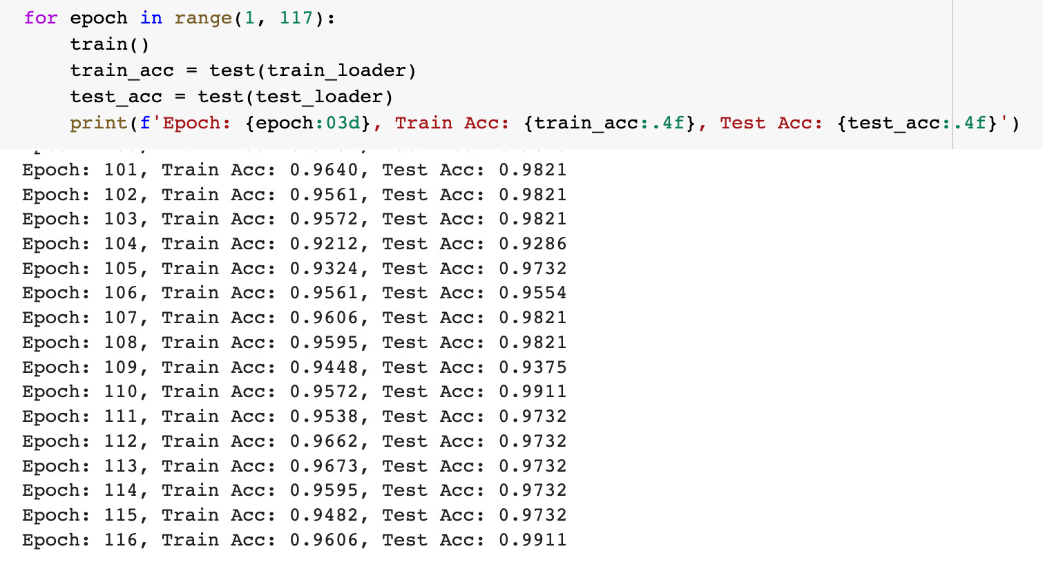 To estimate the model results we used the same model accuracy metrics as in the PyG tutorial: training data accuracy was about 96 percents and testing data accuracy was about 99 percents.
Interpretation of GNN Graph Classification Model results
In the output of the graph classification model we have 36 outliers with the model's predictions not equal to the input labels.
softmax = torch.nn.Softmax(dim = 1)
graph1=[]
for g in range(1000):
  label=dataset[g].y[0].detach().numpy()
  out = model(dataset[g].x.float(), dataset[g].edge_index, dataset[g].batch)
  output = softmax(out)[0].detach().numpy()
  pred = out.argmax(dim=1).detach().numpy()
  graph1.append({'index':g,
                 'label':label,'pred':pred[0],
                 'prob0':round(output[0], 4),'prob1':round(output[1], 4)})

graph2_df=pd.DataFrame(graph1)
len(graph2_df[graph2_df['label']!=graph2_df['pred']])
36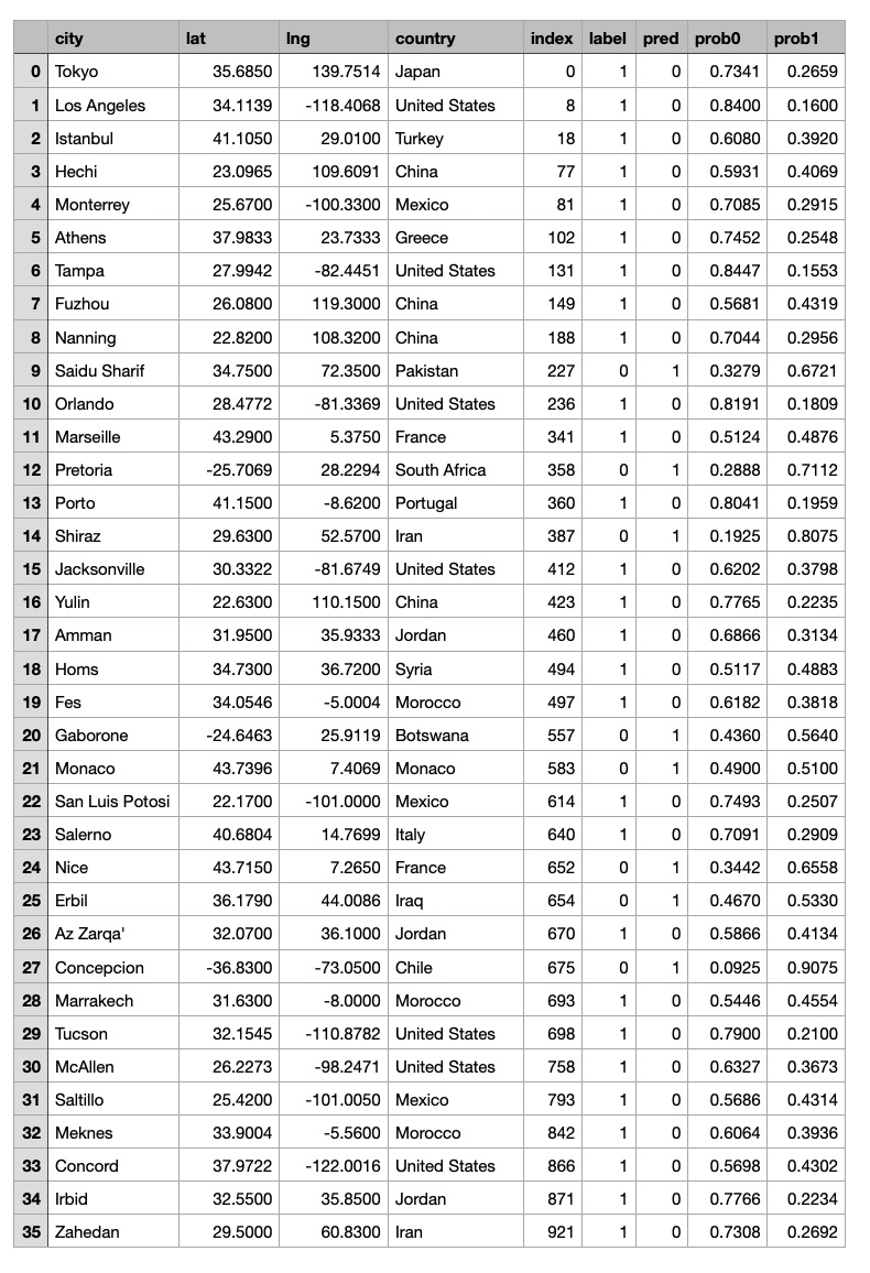 The goal of this study is to identify whether a given graph represents a stable or an unstable climate pattern, based on the temperature data in the corresponding city and the GNN graph classification model was used to learn about the relationships between the nodes within graphs and make predictions about the stability of the temperature patterns over time. The output of the GNN graph classification model would be class labels, such as stable or unstable, indicating the stability of the temperature patterns by graph locations.
Based on our observations of average cosines in consecutive years, for cities close to the equator have very high cosine similarity values which indicates that the temperature patterns in these cities are stable and consistent over time. On the contrary, cities located at higher latitudes may experience more variability in temperature patterns, making them less stable.
These observations correspond with GNN graph classification model results: most of graphs for cities located in lower latitude are classified as stable and graphs of cities located in higher latitude are classified as unstable.
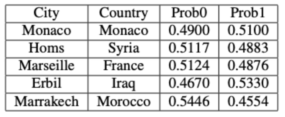
However, the GNN graph classification model results capture some outliers: there are some cities located in higher latitudes that have stable temperature patterns and some cities located in lower latitudes that have unstable temperature patterns. In the table below you can see outliers where the model's predictions do not match the actual temperature stability of these cities.
The goal of this study is to identify whether a given graph represents a stable or an unstable climate pattern, based on the temperature data in the corresponding city and the GNN graph classification model was used to learn about the relationships between the nodes within graphs and make predictions about the stability of the temperature patterns over time. The output of the GNN graph classification model would be class labels, such as stable or unstable, indicating the stability of the temperature patterns by graph locations.
Based on our observations of average cosines in consecutive years, for cities close to the equator have very high cosine similarity values which indicates that the temperature patterns in these cities are stable and consistent over time. On the contrary, cities located at higher latitudes may experience more variability in temperature patterns, making them less stable.
These observations correspond with GNN graph classification model results: most of graphs for cities located in lower latitude are classified as stable and graphs of cities located in higher latitude are classified as unstable.
However, the GNN graph classification model results capture some outliers: there are some cities located in higher latitudes that have stable temperature patterns and some cities located in lower latitudes that have unstable temperature patterns. In the table below you can see outliers where the model's predictions do not match the actual temperature stability of these cities.
 European cities located in higher latitude correspond with the results of our
previous climate time series study where they were indicated as cities with very stable and consistent temperature patterns.
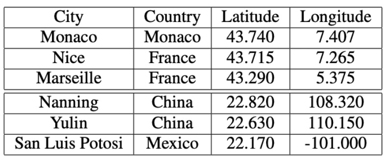
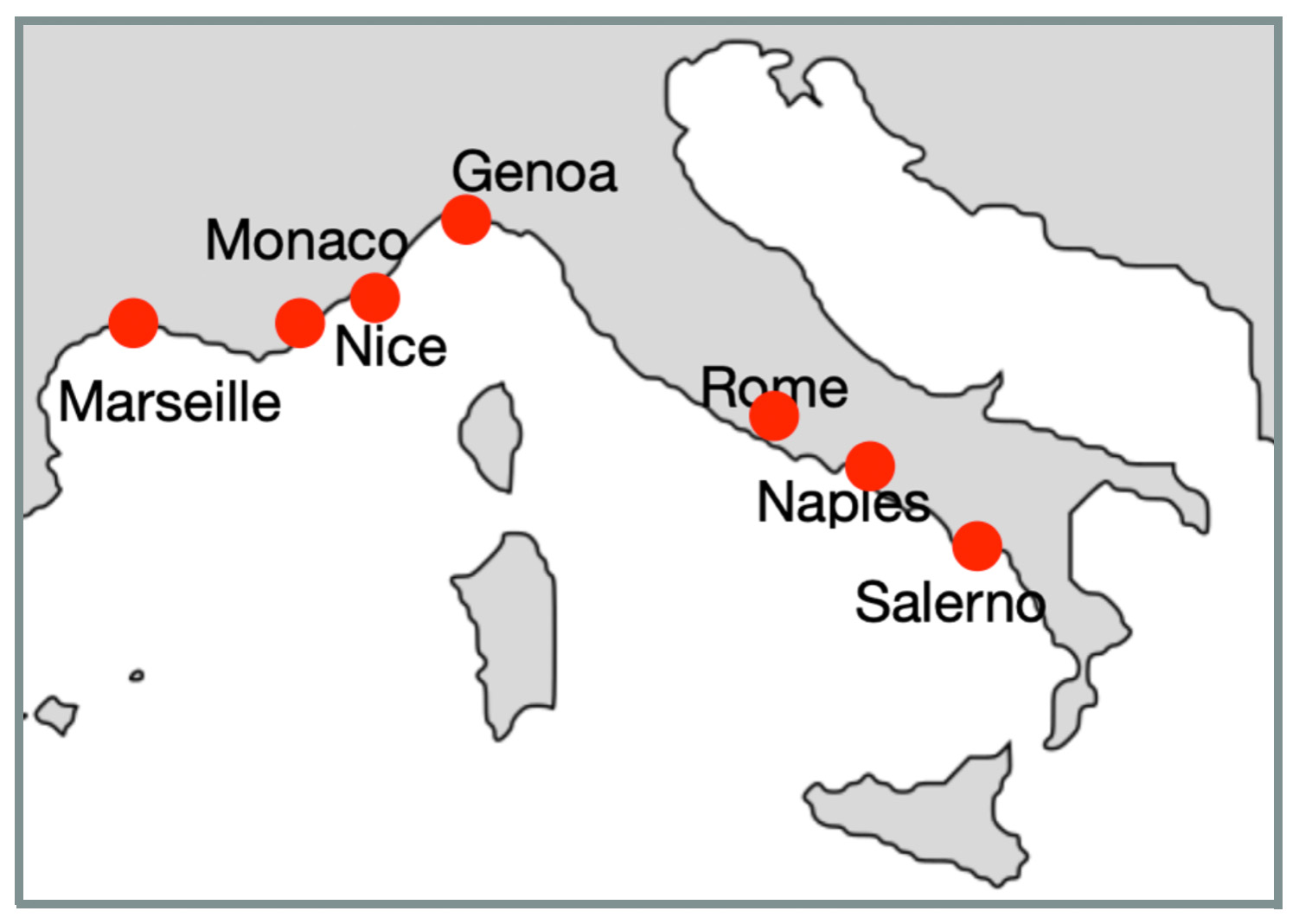
The results of our previous climate time series study showed that cities located near the Mediterranean Sea had high similarity to a smooth line, indicating stable and consistent temperature patterns. In one of climate analysis scenarios we found that most of cities with high similarities to a smooth line are located on Mediterranean Sea not far from each other. Here is a clockwise city list: Marseille (France), Nice (France), Monaco (Monaco), Genoa (Italy), Rome (Italy), Naples (Italy), and Salerno (Italy):
European cities located in higher latitude correspond with the results of our
previous climate time series study where they were indicated as cities with very stable and consistent temperature patterns.
The results of our previous climate time series study showed that cities located near the Mediterranean Sea had high similarity to a smooth line, indicating stable and consistent temperature patterns. In one of climate analysis scenarios we found that most of cities with high similarities to a smooth line are located on Mediterranean Sea not far from each other. Here is a clockwise city list: Marseille (France), Nice (France), Monaco (Monaco), Genoa (Italy), Rome (Italy), Naples (Italy), and Salerno (Italy):
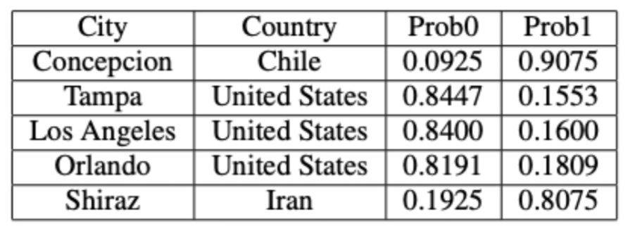
 In the next table below you can see city outliers with the highest outlier probabilities
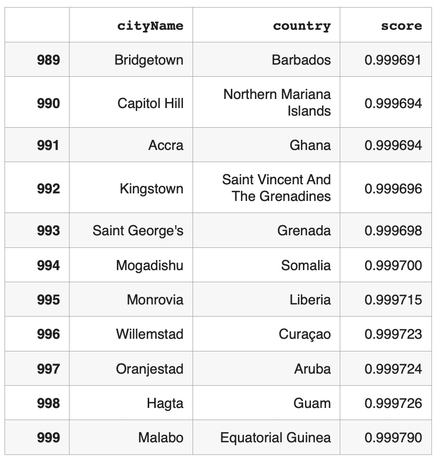
 In the table below you can see outliers with probabilities close to the classification boundary.