LLMs excel at language, but they are natively sequential—making them a poor default tool when the signal is structural and relational. Financial time series have a similar blind spot: standard rolling comparisons summarize local movement, but can miss early shifts in market topology. When relationships matter, Graph AI offers an alternative: we represent each series as a sequence of sliding graphs, use a GNN to embed each graph snapshot into a vector, and align embedding streams to produce local similarity timelines for SPY vs sector ETFs. We compare this to a rolling-window baseline and flag short episodes where the two views disagree most—reviewable moments when relationships may be reorganizing even if sequential similarity looks stable.
Introduction
Large language models (LLMs) have become remarkably good at generating and summarizing text, but their limits show up when we ask them to act like general reasoning engines. As Yann LeCun and others have noted, LLMs are fundamentally sequential: their native representation is a one-dimensional ordering of symbols. That sequential topology is great for fluent continuation, but it is a poor fit for problems where the signal is structural, relational, or shaped by global constraints. In those settings, outputs can sound plausible while still being hard to verify or reconcile at the system level.
This points to a broader issue of representation. Human reasoning does not rely on natural language alone; we use formal languages—mathematics, diagrams, programs—to make structure explicit. Mathematics is not the world itself, but a language for representing quantities and manipulating them under well-defined rules, which makes constraint checking and transformation possible. Graphs play a similar role for relationships. Nodes encode persistent entities, edges encode connections, and topology defines neighborhoods by connectivity rather than positional proximity. Many real-world signals depend on multi-hop dependencies, shared intermediaries, and global relational consistency—properties that are difficult to express faithfully in purely sequential form.
Time series analysis inherits similar constraints. Standard financial time series models represent data as sequences of values indexed by time. This works well for trends, volatility, and local temporal dependence, but it often treats relationships between entities as secondary. Correlations are typically computed pairwise and regime changes inferred indirectly from aggregate metrics, even though relational reorganization across assets can happen before obvious changes appear in individual series.
To address this gap for financial time series, we use Sliding Graphs and adapt them to market data. We construct overlapping temporal windows, build a graph representation for each window, and compute graph embeddings that capture how recent behavior is organized across assets. This produces structure-aware similarity timelines that help detect and localize relationship change (for example, sector reconfiguration or regime shifts) that value-based rolling comparisons can miss. Practically, we flag periods where standard rolling-window similarity and sliding-graph similarity disagree, treating that disagreement as a measurable indicator that market relationships are reorganizing.
From Prior Work to This Study
This study builds directly on our prior work; the four items below are the key building blocks that made the current workflow possible.
1) GNN Graph Classification for time series
We first adapted GNN graph classification (commonly used for molecular graph labeling) to
time series by turning time-local segments into graph snapshots and training a graph classifier
on those graphs. A key practical detail in this line of work is the virtual node, added to stabilize
message passing and produce a consistent graph-level representation.
Blog: https://sparklingdataocean.com/2023/02/11/cityTempGNNgraphs/
Presented at: ICANN 2023 — Crete, Greece (Sep 2023) and COMPLEX NETWORKS 2023 — Menton, France (Nov 2023).
2) Sliding graphs (introduced on climate time series)
We then formalized sliding graphs: instead of treating a long sequence as one object, we represent it
as a sequence of overlapping graph snapshots, each capturing recent local behavior and structure.
Blog: http://sparklingdataocean.com/2024/05/25/slidingWindowGraph/
Presented at: ICMLT 2024 — Oslo, Norway (May 2024).
3) Pre-final vectors from GNN graph classification
Next, we showed how to reuse the model’s pre-final vectors (graph embeddings right before the last layer)
as a stable representation you can track, compare, and analyze beyond classification.
Blog: https://sparklingdataocean.com/2024/07/04/vectorsGNN/
Presented at: MLG 2024 (ECML-PKDD 2024 workshop) — Vilnius, Lithuania (Sep 2024).
4) Time-aligned sliding-graph embeddings for new time series (EEG)
Finally, we applied the same sliding graphs + embeddings workflow to EEG and introduced
time-aligned embedding streams for comparing structure over time.
Blog: https://sparklingdataocean.com/2025/01/25/slidingWindowGraph-EEG/
Presented at: Brain Informatics 2025 — Bari, Italy (Nov 2025).
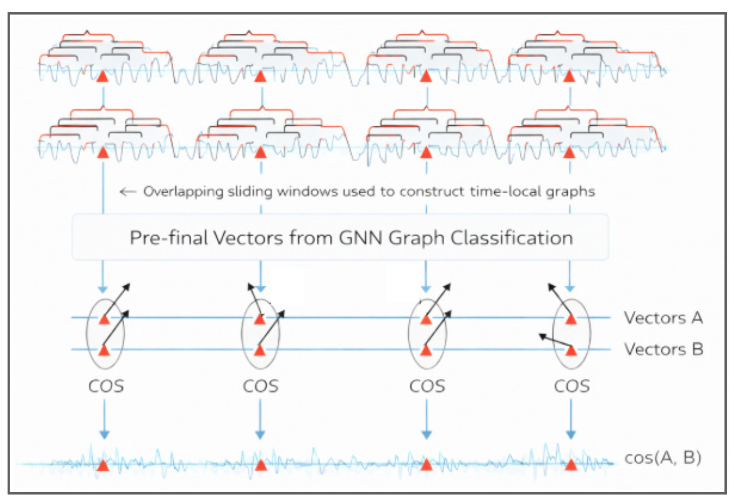
Methods
Pipeline overview: from time series to a time-aligned similarity signal
This pipeline converts a pair of time series into a single, time-aligned similarity timeline. The key idea is to compare two streams of learned graph embeddings at matching time points, rather than comparing raw values directly.
Our pipeline for this study consists of several stages.-
Start with two time series (A and B).
The goal is to track how their relationship evolves over time, not just compute one global similarity. -
Create overlapping sliding windows.
Each window captures a short, recent segment of behavior. Overlap ensures a dense sequence of time-local snapshots. -
Construct sliding graphs.
For every window, build a small graph snapshot that encodes local structure (e.g., which window-elements behave similarly and how they connect). This turns time into a sequence of graphs. -
Run a GNN and keep the pre-final embeddings.
A graph neural network processes each graph snapshot and produces a compact embedding vector that summarizes the structure of that window. Doing this for both series yields two embedding streams over time: Vectors A and Vectors B. -
Align embeddings by timestamp and compute similarity at each time point.
At each aligned window time, compute a similarity score (e.g., cosine similarity) between the embedding from A and the embedding from B. -
Obtain a similarity timeline.
The output is a time series of similarity scores that reflects how the two series compare window-by-window in the learned embedding space—capturing changes in the organization/structure of recent patterns.
In practice, this similarity timeline can be scanned for intervals where relationships strengthen, weaken, or reorganize—providing time-local “periods of interest” for deeper interpretation.
Sliding graph definition
In our previous study, GNN Graph Classification for Time Series: A New Perspective on Climate Change Analysis, we introduced an approach to constructing graphs using the Sliding Window Method.

Data to Graph Transformation
Time series data is segmented into overlapping windows using the sliding window technique. Each segment forms a unique graph, allowing for the analysis of local temporal dynamics.
In these graphs:
- Nodes: Represent data points within the window, with features derived from their values.
- Edges: Connect pairs of nodes to maintain temporal relationships.
Key Parameters:
- Window Size (W): Determines the size of each segment.
- Shift Size (S): Defines the degree of overlap between windows.
- Edge Definitions: Tailored to the specific characteristics of the time series, helping detect meaningful patterns.
Node calculation
For a dataset with N data points, we apply a sliding window of size W with a shift of S to create nodes. The number of nodes, Nnodes, is calculated as:
Graph calculation
With the nodes determined, we construct graphs, each comprising G nodes, with a shift of Sg between successive graphs. The number of graphs, Ngraphs, is calculated by:
Graph construction
Cosine similarity matrices are generated from the time series data and transformed into graph adjacency matrices.
- Edge Creation: Edges are established for vector pairs with cosine values above a defined threshold.
- Virtual Nodes: Added to ensure network connectivity, enhancing graph representation.
This framework effectively captures both local and global patterns within the time series, yielding valuable insights into temporal dynamics.
GNN graph classification
We employ the GCNConv model from the PyTorch Geometric Library for GNN Graph Classification tasks. This model performs convolutional operations, leveraging edges, node attributes, and graph labels to extract features and analyze graph structures comprehensively.
By combining the sliding window technique with Graph Neural Networks, our approach offers a robust framework for analyzing time series data. It captures intricate temporal dynamics and provides actionable insights into both local and global patterns, making it particularly well-suited for applications such as EEG data analysis. This method allows us to analyze time series data effectively by capturing both local and global patterns, providing valuable insights into temporal dynamics.
Experiments
Data
For this project, we keep the dataset intentionally small: five liquid U.S. ETFs that tend to behave differently across market regimes—so shifts in “relationships” and sector rotation have a chance to show up:
- SPY (S&P 500)
- XLK (Technology)
- XLE (Energy)
- XLF (Financials)
- XLU (Utilities)
We pull daily prices from Yahoo Finance using yfinance, and we use Adjusted Close so
splits and dividends don’t create artificial jumps in the series. In our run, we request data starting 1998-12-01,
then align all tickers to the intersection of trading dates (shared window
1998-12-22 to 2026-01-21, 6811 rows per ETF). The aligned series are saved to
Parquet (one file per ticker) so downstream steps load instantly without re-downloading.
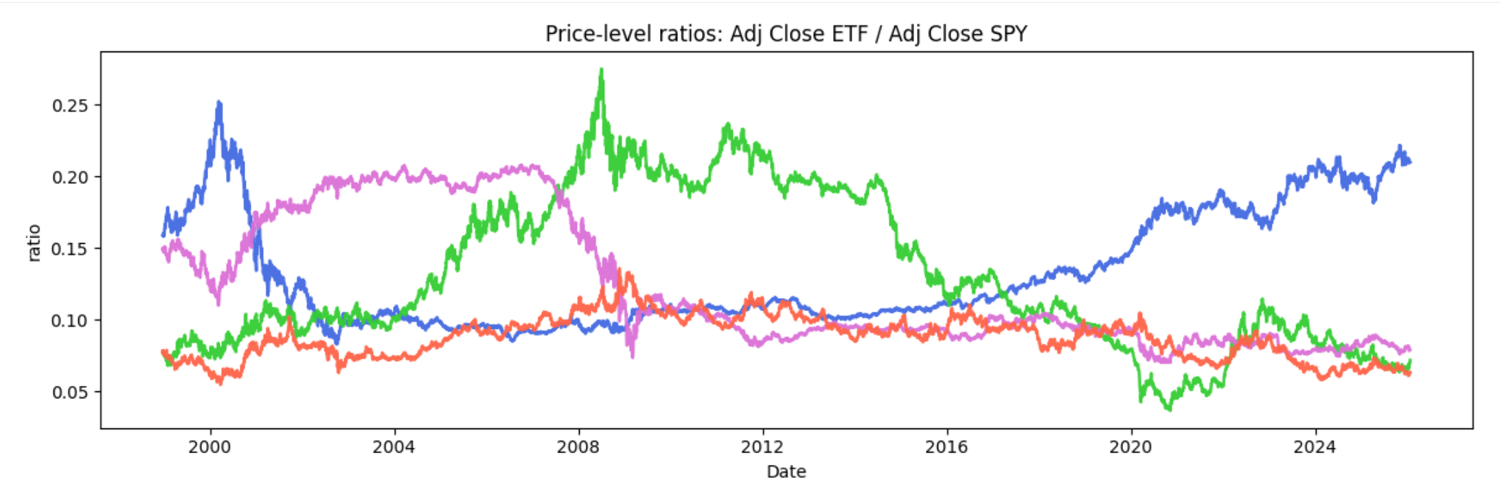
Because these ETFs trade at very different price levels, we don’t plot raw prices. Instead, we normalize each series so it starts at 1.0 on the first shared trading day:
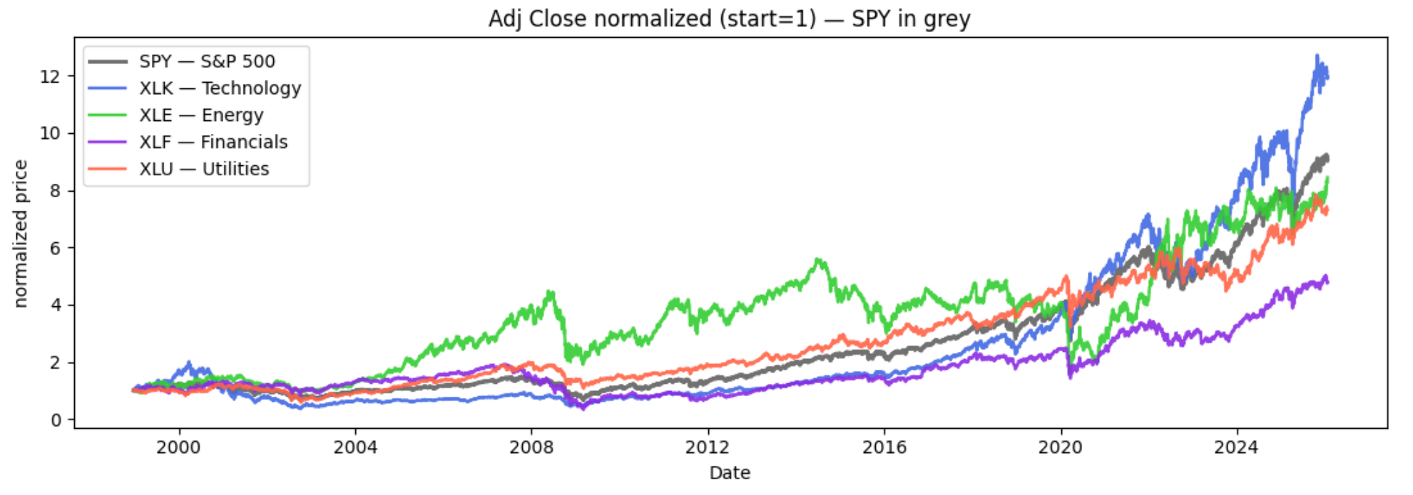
We’re going to analyze how relationships evolve between SPY and each sector ETF. As a quick illustration, the chart
below shows price ratios of each ETF versus SPY, which makes it easier to see when a sector is leading or lagging
the broad market.
A few major periods stand out. Tech (XLK) shows two clear eras of relative leadership: a surge during the
dot-com period (late 1990s into the early 2000s) followed by a sharp reversal, and then a renewed, sustained push
in the recent AI-driven boom (2023–present). Financials (XLF) is dominated by the
2008 crisis, where the ratio collapses and the recovery afterward follows a noticeably different trajectory.
Finally, COVID (2020) appears as a sharp relationship shock, with a rapid drawdown, quick rebound, and a clear
reshuffling of sector leadership.
Creating graph nodes
For each ETF, we start with its Adjusted Close time series and turn it into a set of graph nodes, where each node represents a short, fixed-length “recent history” of price movement. Concretely, we slide a window of length W over the series (step S). Each window becomes one node.
Before we do anything graph-like, we normalize each window so that it starts at the same baseline. The simplest view is price normalization:
Normalized price(t) = AdjClose(t) / AdjClose(t₀)
This forces every window to start at 1.0 on day one, so we focus on shape rather than absolute price level.
In the implementation, we use the log version of the same idea because it behaves better numerically and aligns with how finance often models returns. For a window starting at time t₀, we compute a relative log-price path:
features = log(price_window) − log(price_window[0])
So each node feature vector encodes the trajectory of that ETF over the next W points, expressed relative to the first value in the window. Intuitively: every node says, “starting from here, what did the local path look like?” This gives us a clean, comparable node representation across different ETFs and time periods—exactly what we need before constructing sliding graphs over these nodes.
Inputs
-
df(DataFrame) with at least:timestamp_col(default"timestamp")price_col(default"adj_close", must be > 0; non-positive rows are dropped)
symbol(string) used to build unique node names-
Windowing parameters:
W = 32: node window length (feature vector size)S = 1: node stride (step between windows)G = 32: nodes per graph snapshotSg = 6: snapshot stride
graph_label(int) assigned to all snapshots from this callepsprotects the log transform
Output
A DataFrame where each row is a node-in-snapshot, with columns:
graph_name, graph_label, node_name, and
f0 … f{W-1}.
If there isn’t enough data to form windows (N < W) or snapshots (n_nodes < G), the function returns
an empty DataFrame with the expected columns.
Function: fin_graph_nodes.py
from __future__ import annotations
import numpy as np
import pandas as pd
def fin_graph_nodes(
    df: pd.DataFrame,
    symbol: str,
    timestamp_col: str = "timestamp",
    price_col: str = "adj_close",
    W: int = 32,
    S: int = 1,
    G: int = 32,
    Sg: int = 6,
    graph_label: int = 0,
    eps: float = 1e-12,   # protects log(0)
) -> pd.DataFrame:
    if W <= 0 or G <= 0 or S <= 0 or Sg <= 0:
        raise ValueError("W, G, S, Sg must be positive integers.")
    d = df[[timestamp_col, price_col]].copy()
    d[timestamp_col] =
       pd.to_datetime(d[timestamp_col], utc=True, errors="coerce")
    d[price_col] = pd.to_numeric(d[price_col], errors="coerce")
    d = d.dropna(subset=[timestamp_col, price_col])
       .sort_values(timestamp_col).reset_index(drop=True)
    d = d[d[price_col] > 0].reset_index(drop=True)
    prices = d[price_col].to_numpy(dtype=float)
    ts = d[timestamp_col].to_list()
    N = len(prices)
    out_cols = ["graph_name", "graph_label", "node_name"] +
      [f"f{i}" for i in range(W)]
    if N < W:
        return pd.DataFrame(columns=out_cols)
    logp = np.log(np.maximum(prices, eps))
    node_starts = np.arange(0, N - W + 1, S, dtype=int)
    node_names = np.array([f"{symbol}_{ts[i].isoformat()}"
    for i in node_starts], dtype=object)
    X = np.stack(
        [(logp[i:i + W] - logp[i]) for i in node_starts],
        axis=0)
    n_nodes = X.shape[0]
    if n_nodes < G:
        return pd.DataFrame(columns=out_cols)
    graph_starts = np.arange(0, n_nodes - G + 1, Sg, dtype=int)
    rows = []
    for gs in graph_starts:
        gname = node_names[gs]
        for j in range(G):
            nm = node_names[gs + j]
            feat = X[gs + j]
            row = {"graph_name": gname, "graph_label": int(graph_label),
            "node_name": nm}
            row.update({f"f{k}": float(feat[k]) for k in range(W)})
            rows.append(row)
   return pd.DataFrame(rows, columns=out_cols)
Graph edges
Once we have the node windows table, we build edges for each sliding graph snapshot. Edges define which nodes are “related” within that snapshot and control how information flows in the GNN.
Virtual-node edges (always on)
For every snapshot, we add one special virtual node and connect it to every real node (a star pattern). This makes
each input graph a single connected component, which helps GNN graph classification models learn a
stable graph-level representation. The virtual node acts as a global anchor, aggregating signals from all nodes.
Cosine-similarity edges (optional)
Within each snapshot, we optionally connect node pairs whose feature vectors are highly similar (above a cosine threshold). This
links windows with similar local shape, capturing repeating patterns.
Inputs: the previously created nodes table, a
cosine_threshold = 0.95.
Outputs: a new nodes table with one virtual node added per graph, and an edges table with
graph_name, left, right, and edge_type.
Function: fin_graph_edges.py
from __future__ import annotations
from pathlib import Path
from typing import Optional, Tuple, Union
import numpy as np
import pandas as pd
PathLike = Union[str, Path]

def _feature_cols(df: pd.DataFrame) -> list[str]:
    fcols = [c for c in df.columns
    if isinstance(c, str) and c.startswith("f") and c[1:].isdigit()]
    fcols.sort(key=lambda s: int(s[1:]))
    if not fcols:
        raise ValueError("No feature columns found (expected f0..fK).")
    return fcols

def _normalize_windows(X: np.ndarray, mode: str = "zscore", eps: float = 1e-12)
   -> np.ndarray:
    if mode == "none":
        return X
    mu = np.nanmean(X, axis=1, keepdims=True)
    Xc = X - mu
    if mode == "demean":
        return Xc
    if mode == "zscore":
        sd = np.nanstd(Xc, axis=1, keepdims=True)
        sd = np.where(sd > 0, sd, 1.0)
        return Xc / (sd + eps)
    raise ValueError("window_norm must be one of: 'zscore', 'demean', 'none'")

def build_cosine_edges_with_virtual(
    nodes_table: pd.DataFrame,
    *,
    cosine_threshold: float = 0.92,
    virtual_node_name: str = "__VIRTUAL__",
    normalize_windows: bool = True,
    window_norm: str = "zscore",
    eps: float = 1e-12,
) -> Tuple[pd.DataFrame, pd.DataFrame]:
    if not isinstance(nodes_table, pd.DataFrame):
        raise TypeError("nodes_table must be a pandas DataFrame")
    if nodes_table.empty:
        return nodes_table.copy(),
          pd.DataFrame(columns=["graph_name", "left", "right", "edge_type"])
    required = {"graph_name", "graph_label", "node_name"}
    missing = required - set(nodes_table.columns)
    if missing:
        raise ValueError(f"Missing required columns: {sorted(missing)}")
    fcols = _feature_cols(nodes_table)
    edges = []
    virtual_rows = []
    for gname, g in nodes_table.groupby("graph_name", sort=False):
        glabel = int(g["graph_label"].iloc[0])
        X_full = g[fcols].to_numpy(dtype=float)
        names_all = g["node_name"].astype(str).to_numpy()
        valid = ~np.isnan(X_full).any(axis=1)
        if int(valid.sum()) >= 2:
            X = X_full[valid]
            names_valid = g.loc[valid, "node_name"].astype(str).to_numpy()
            if normalize_windows:
                X = _normalize_windows(X, mode=window_norm, eps=eps)
            norms = np.linalg.norm(X, axis=1, keepdims=True)
            norms = np.where(norms > 0, norms, 1.0)
            Xn = X / (norms + eps)
            sim = Xn @ Xn.T
            n = sim.shape[0]
            iu, ju = np.triu_indices(n, k=1)
            keep = sim[iu, ju] >= float(cosine_threshold)
            for i, j in zip(iu[keep], ju[keep]):
                left, right = names_valid[i], names_valid[j]
                if left > right:
                    left, right = right, left
                edges.append((gname, left, right, "cosine"))
        vfeat = np.nanmean(X_full, axis=0)
        vrow = {"graph_name": gname, "graph_label": glabel,
           "node_name": virtual_node_name}
        vrow.update({c: float(v) for c, v in zip(fcols, vfeat)})
        virtual_rows.append(vrow)
        for nm in names_all:
            left, right = virtual_node_name, nm
            if left > right:
                left, right = right, left
            edges.append((gname, left, right, "virtual"))
    nodes_out = pd.concat([nodes_table,
      pd.DataFrame(virtual_rows)], ignore_index=True)
    edges_df = pd.DataFrame(edges, columns=["graph_name",
      "left", "right", "edge_type"]).drop_duplicates()
    return nodes_out, edges_df

def fin_graph_edges(
    nodes_input: Union[pd.DataFrame, PathLike],
    *,
    cosine_threshold: float = 0.92,
    virtual_node_name: str = "__VIRTUAL__",
    normalize_windows: bool = True,
    window_norm: str = "zscore",
    save_dir: Optional[PathLike] = None,
    out_prefix: str = "etf",
) -> Tuple[pd.DataFrame, pd.DataFrame]:
    if isinstance(nodes_input, pd.DataFrame):
        nodes_table = nodes_input
    else:
        p = Path(nodes_input)
        if not p.exists():
            raise FileNotFoundError(p)
        if p.suffix.lower() in [".parquet", ".pq"]:
            nodes_table = pd.read_parquet(p)
        elif p.suffix.lower() == ".csv":
            nodes_table = pd.read_csv(p)
        else:
            raise ValueError("Unsupported file type. Use .parquet or .csv.")
    nodes_out, edges_df = build_cosine_edges_with_virtual(
        nodes_table,
        cosine_threshold=cosine_threshold,
        virtual_node_name=virtual_node_name,
        normalize_windows=normalize_windows,
        window_norm=window_norm,)
    if save_dir is not None:
        out_dir = Path(save_dir)
        out_dir.mkdir(parents=True, exist_ok=True)
        nodes_out.to_parquet(out_dir / f"{out_prefix}_nodes_virtual.parquet",
          index=False)
        edges_df.to_parquet(out_dir / f"{out_prefix}_edges.parquet", index=False)
    return nodes_out, edges_df
Create graph list
At this stage, we convert each ticker’s saved tables into a list of small graph snapshots that a GNN can consume. We run
fin_graph_list once per ticker (SPY, XLK, XLE, XLF, XLU), load that ticker’s
nodes_with_virtual and edges, and export a PyTorch Geometric Data object for each
graph_name window. The result is a graph list per ticker, saved to disk so we can reuse it without
rebuilding features and edges.
Later, in the GNN graph classification step, we reuse the SPY graph list four times—paired with each sector ETF list—so the comparison is always “SPY vs ETF,” but the graph lists themselves are created and stored independently.
Inputs: one ticker’s nodes_with_virtual table and its edges table (paths to
.parquet/.csv).
Outputs: a data_list of PyG Data graphs (one per graph_name), saved as a
.pkl file for that ticker.
Function: fin_graph_list.py
from __future__ import annotations
from pathlib import Path
from typing import List, Union, Optional
import numpy as np
import pandas as pd
PathLike = Union[str, Path]

def _load_table(path: Path) -> pd.DataFrame:
    if path.suffix.lower() in [".parquet", ".pq"]:
        return pd.read_parquet(path)
    if path.suffix.lower() == ".csv":
        return pd.read_csv(path)
    raise ValueError(f"Unsupported file type: {path.suffix}. Use .parquet or .csv")

def fin_graph_list(
    nodes0_path: PathLike,
    edges0_path: PathLike,
    nodes1_path: PathLike,
    edges1_path: PathLike,
    *,
    save: bool = True,
    out_name: Optional[str] = None,
) -> List["Data"]:
    import pickle
    import torch
    from torch_geometric.data import Data
    n0p, e0p, n1p,
    e1p = map(lambda p: Path(p), [nodes0_path, edges0_path, nodes1_path, edges1_path])
    for p in [n0p, e0p, n1p, e1p]:
        if not p.exists():
            raise FileNotFoundError(f"File not found: {p}")
    nodes0 = _load_table(n0p)
    edges0 = _load_table(e0p)
    nodes1 = _load_table(n1p)
    edges1 = _load_table(e1p)
    nodes_table = pd.concat([nodes0, nodes1], ignore_index=True)
    edges_table = pd.concat([edges0, edges1], ignore_index=True)
    fcols = [c for c in nodes_table.columns if isinstance(c, str)
       and c.startswith("f") and c[1:].isdigit()]
    fcols.sort(key=lambda s: int(s[1:]))
    if not fcols:
        raise ValueError("No feature columns found (expected f0..fK).")
    required_edges = {"graph_name", "left", "right"}
    miss_e = required_edges - set(edges_table.columns)
    if miss_e:
        raise ValueError(f"Edges table missing columns: {sorted(miss_e)}")
    data_list: List[Data] = []
    for gname, nd in nodes_table.groupby("graph_name", sort=False):
        X = nd[fcols].to_numpy(dtype=np.float32)
        x = torch.from_numpy(np.nan_to_num(X))
        y = torch.tensor([int(nd["graph_label"].iloc[0])], dtype=torch.long)
        name_to_idx =
           {n: i for i, n in enumerate(nd["node_name"].astype(str).tolist())}
        ed = edges_table[edges_table["graph_name"] == gname]
        src, dst = [], []
        for a, b in zip(ed["left"].astype(str), ed["right"].astype(str)):
            if a in name_to_idx and b in name_to_idx:
                ia, ib = name_to_idx[a], name_to_idx[b]
                src += [ia, ib]
                dst += [ib, ia]
        edge_index = (
            torch.tensor([src, dst], dtype=torch.long)
            if len(src) > 0
            else torch.empty((2, 0), dtype=torch.long)
        )
        data = Data(x=x, edge_index=edge_index, y=y)
        data.graph_name = str(gname)
        data.node_names = nd["node_name"].astype(str).tolist()
        data_list.append(data)
    if save:
        out_dir = n0p.parent
        if out_name is None:
            sym0 = n0p.stem.replace("_with_virtual", "")
            sym1 = n1p.stem.replace("_with_virtual", "")
            out_name = f"fin_graphs_{sym0}__{sym1}.pkl"
        out_path = out_dir / out_name
        with open(out_path, "wb") as f:
            pickle.dump(data_list, f)
    return data_list
GNN graph classification
Next, we train a PyG GNN graph classification model on pairs of graph lists. Each run combines SPY with one sector ETF: SPY–XLK, SPY–XLE, SPY–XLF, SPY–XLU. The graph lists were created earlier and reused here; this step is purely about learning from those prebuilt sliding-graph snapshots.
The model predicts a binary graph label, but the main artifact we keep is the pre-final vectors: the sliding-graph embeddings (one embedding per snapshot).
Inputs: two precomputed graph lists (one for SPY, one for the sector ETF).
Outputs: a time-aligned table of graph embeddings (one row per snapshot) plus
accuracy metrics:
- SPY–XLE: train 0.791, test 0.713
- SPY–XLF: train 0.668, test 0.607
- SPY–XLK: train 0.713, test 0.633
- SPY–XLU: train 0.708, test 0.589
From GNN outputs to similarity timelines
After training the GNN graph-classification model, we keep the pre-final embedding vectors produced for each sliding-graph snapshot. Because each snapshot corresponds to a specific time window, stacking these vectors in order gives a time-aligned embedding stream for each series.
To convert embeddings into a similarity timeline, we: (1) attach each embedding to its window timestamp, (2) align the two embedding streams on the same timestamps, and (3) compute a single cosine similarity score between the two embedding vectors at each aligned time point.
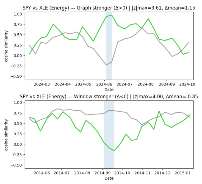
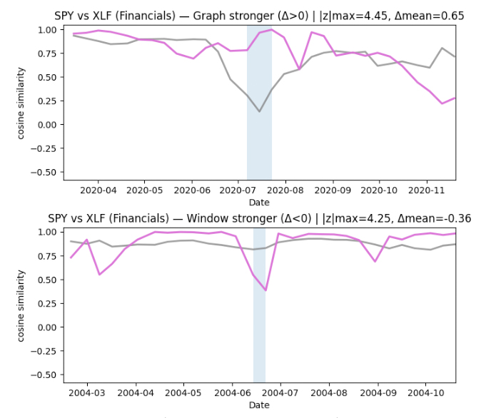
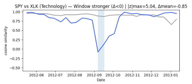
In parallel, we compute a sliding-window similarity baseline directly from the original rolling window (node) vectors. Plotting the sliding-graph and sliding-window similarity timelines together makes it easy to see when the two views track each other—and when they diverge.
Interpreting the similarity timelines
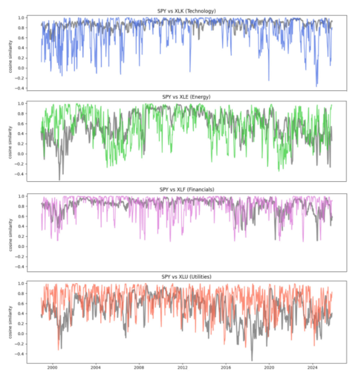
We plot two similarity timelines for each pair (SPY, sector ETF) on the same dates. The goal is to compare two different “views” of how closely a sector is behaving relative to the broad market over time.
The first line is a sliding-window baseline (shown in grey). It answers a simple question: do the recent price paths look similar right now? In other words, it’s a local, short-horizon comparison of how the two series have been moving recently.
The second line is a sliding-graph similarity (shown in color). It uses learned graph embeddings from our sliding-graph representation. This view is meant to capture similarity in the organization of recent patterns, not just whether two recent paths look alike point-by-point.
Across pairs, the two timelines are often broadly consistent, but they are not identical. There are clear intervals where the window baseline stays relatively high while the graph-based similarity drops (and sometimes the reverse). That divergence is the key signal we use next — it suggests the two representations are emphasizing different aspects of the same market behavior.
Finding time periods of interest from disagreement
To identify time periods worth investigating, we focus on where the two similarity timelines disagree the most. For each pair (SPY, sector ETF), we align the two signals on the same timestamps and compute a simple “difference” timeline: when the graph-based similarity is much higher or much lower than the sliding-window baseline.
We then scan this difference signal for unusually large deviations, and group nearby deviations into short contiguous episodes. This turns scattered spikes into more interpretable time intervals.
Finally, we keep the strongest 1–2 episodes per sector as candidate periods of interest. In the current run, this produced clear episodes for Energy and Financials, only a single episode for Technology, and none for Utilities at the chosen sensitivity threshold. These episodes give us concrete, time-localized targets for deeper interpretation — moments when the graph view and the window view tell meaningfully different stories about similarity.
Conclusion
In this post, we showed how to treat time series as a sequence of small graph snapshots, then use a GNN to produce time-aligned graph embeddings. By comparing embedding similarity to a simple rolling-window similarity baseline, we get two complementary views of how relationships evolve over time.
The main takeaway is that the most interesting signal often appears where these two views disagree. When the window baseline and the graph-based similarity diverge, it suggests that “recent values” may look similar while the organization of patterns has changed (or vice versa). We use that disagreement as a practical way to flag candidate periods of relationship reconfiguration.
In this run, the disagreement detector produced clear periods of interest for some sectors (notably Energy and Financials), only one for Technology, and none for Utilities at the chosen sensitivity. That’s exactly what we want at this stage: a small set of time-localized intervals worth interpreting, rather than a noisy stream of alerts.
This is an intentionally small, public-data experiment on daily prices. The goal is not to claim predictive power from a single chart, but to demonstrate a representation and a workflow that turns “relationship change” into something measurable and reviewable.
Looking ahead, we currently compute similarity at aligned timestamps, but we can generalize this to lagged similarity to produce lead–lag timelines—measuring whether structural changes in one series tend to precede another. While lagged similarity is not a causal proof, it can be a practical screening tool for identifying directed relationship episodes. With richer, non-public market data, the same approach can go further—for example: (1) minute-by-minute trading and pricing data can show when the market’s “health” changes and when connections between assets suddenly tighten or snap, (2) short-horizon buy/sell activity can reveal who tends to move first and when large, mechanical repositioning dominates everyday trading, and (3) internal trade records can uncover repeatable trading patterns and flag unusual periods when the usual relationships between instruments abruptly change.