Why AI Needs a Shared Language
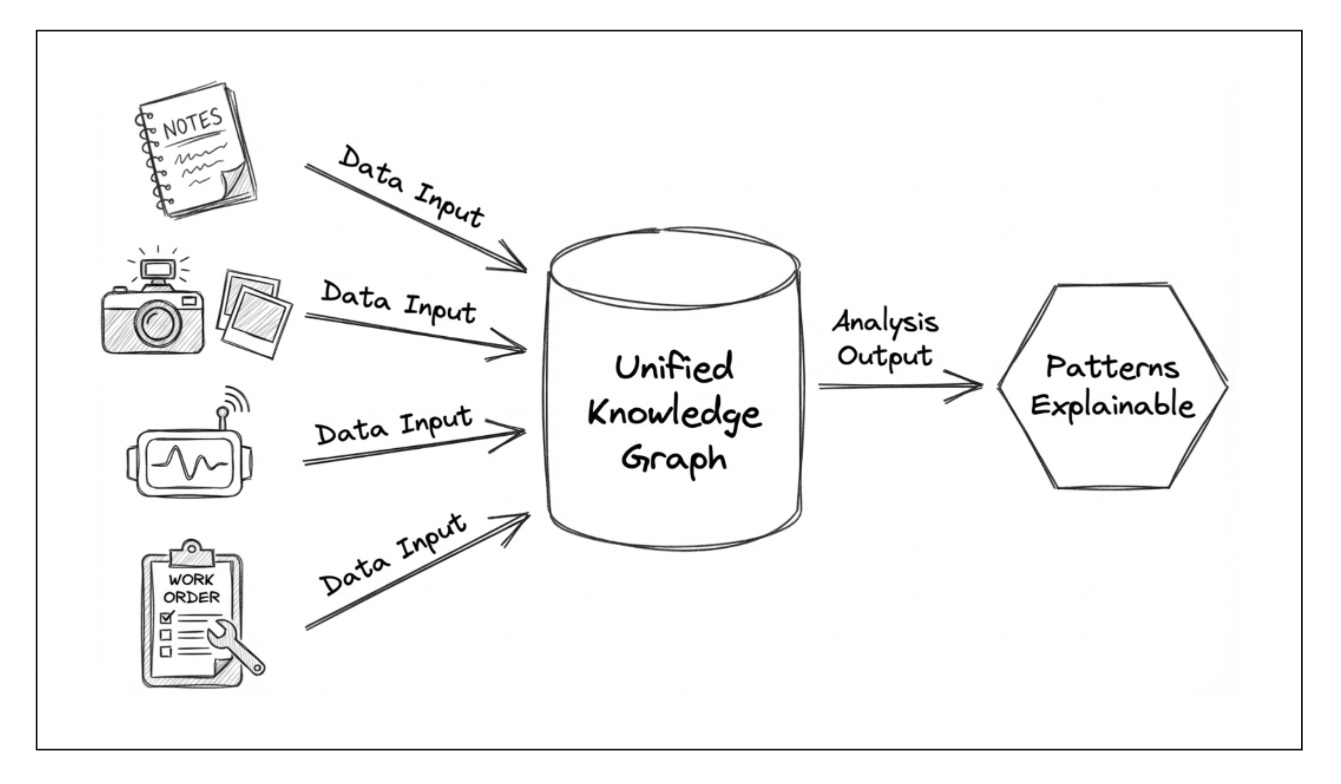
Modern data doesn’t come in neat tables anymore. It shows up as text, time-series signals, dashboards, maps, logs, and relationships—often all describing the same entities from different angles. Countries, companies, patients, products: each is surrounded by stories, numbers, and connections that live in separate systems and are analyzed with separate tools.
AI can handle each data type in isolation. Language models read text. Statistical models handle time series. Graph methods analyze relationships. But the real insight lives between these views. The hard part isn’t modeling text or numbers—it’s making them comparable, relational, and interpretable together.
That’s where Unified Knowledge Graphs (UKGs) come in.
Unified Knowledge Graphs help by acting as a relationship layer that can hold all these views together. And here’s the important clarification for anyone who hears “graph” and immediately thinks “graph database” or “Cypher/SPARQL”: you don’t need a graph database, and you don’t need graph query languages for this. A “graph” here is simply a lightweight way to express relationships—nodes and edges—even if your data still lives in SQL, Parquet, or JSON.A UKG doesn’t just connect entities with edges. It aligns heterogeneous data into a common representation so text, time series, and relationships can be analyzed side by side. The challenge is that these modalities speak different mathematical languages. Simply attaching embeddings to nodes—or concatenating features late in the pipeline—often produces representations that look unified, but aren’t truly comparable.
In this work, we explore a simple idea: use GNN link prediction as an alignment mechanism.
Instead of forcing every data type into a single model, we let each modality keep its native representation—but train all modalities under the same relational objective. By learning embeddings that must explain observed relationships in the graph, each modality is effectively “compiled” into a shared vector space—a common coordinate system where similarities, differences, and outliers become meaningful across data types.
We illustrate the approach using countries as entities, borders as relationships, Factbook text as narrative context, and World Bank time series (GDP, life expectancy, internet usage) as numeric signals. Borders act as an interpretable backbone—not because geography is the goal, but because it provides a clean way to test whether different modalities align (or fail to align) once embedded into the same space.
The result is not one monolithic model, but a unified embedding space that gives you:
- a single coordinate system for text and numeric signals,
- embeddings shaped by real relationships, not just feature similarity,
- multimodal profiles that can be compared, fused, and analyzed consistently.
Although demonstrated here at the country level, the idea is domain-agnostic. Any setting with heterogeneous attributes and meaningful relationships—enterprises, products, biological entities, infrastructure systems—can benefit from treating a knowledge graph as an alignment layer, not just a storage layer.
In short: unified knowledge graphs aren’t about adding more data—they’re about giving AI a common language for reasoning over relationships.
Methods: Turning Heterogeneous Data into a Shared Graph Language
The goal of this pipeline is not to train a single task-specific model, but to create a shared embedding space in which heterogeneous country attributes—text, time series, and relationships—become directly comparable. The unifying idea is simple: every modality is aligned through the same relational task.
Instead of forcing different data types into one model, we let each modality keep its native representation, then use GNN link prediction as a common alignment mechanism. This produces relationship-aware embeddings that all live in the same vector space.
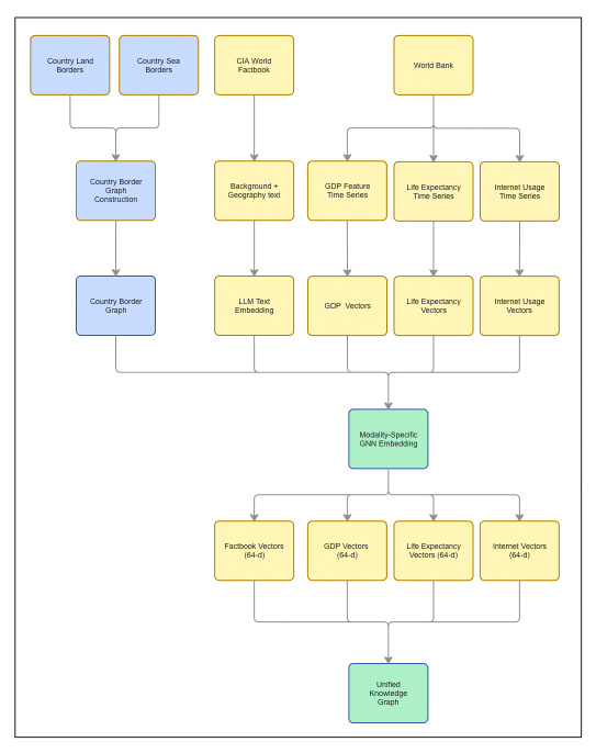
Relational Backbone: Country Borders
We start by constructing a country-level graph. Each node represents a sovereign state. Edges encode geographic adjacency derived from two sources: land borders and maritime (sea) borders.
The two graphs are merged into a single border topology, with each edge labeled as
land, sea, or both.
This border graph is fixed and shared across all modalities,
acting as the relational backbone that aligns every embedding.
Multimodal Node Attributes
Each country node is associated with multiple, heterogeneous feature channels. These channels are intentionally kept separate through most of the pipeline.
Text: CIA World Factbook
For each country, we extract two narrative fields from the CIA World Factbook: Background and Geography. These are concatenated into a single document describing historical, political, and geographic context.
The text is embedded using the all-MiniLM-L6-v2 sentence transformer,
producing a fixed-length vector per country. These vectors serve as the text feature channel
for graph learning.
Time Series: World Bank Indicators
We use three socio-economic indicators from the World Bank: GDP per capita, life expectancy at birth, and internet usage. Each indicator is represented as a yearly sequence per country.
Within each indicator, values are normalized, missing years are interpolated along the time axis, and countries with insufficient coverage are removed. The result is one fixed-length time-series vector per country, per indicator.
Alignment via GNN Link Prediction
Each modality—text and each time-series indicator—is aligned separately using the same GNN link-prediction objective on the shared border graph. We use GraphSAGE with identical architecture and training protocol across modalities.
Link prediction is used deliberately: it forces embeddings to explain observed relationships. As a result, each modality is translated into a relationship-aware representation, shaped by the same topology.
Every model outputs a 64-dimensional embedding per country. Because all modalities share the same graph structure, objective, and embedding dimension, their vectors lie in a common latent space and can be compared directly.
From Modality-Specific to Unified Representations
At this point, each country has multiple embeddings: one from text and one from each time-series indicator. These vectors are already comparable—but still modality-specific.
To construct a single unified representation, we concatenate the four modality vectors into a 256-dimensional multimodal profile and project it back to 64 dimensions. This projection is an explicit unification step, not a late-stage heuristic.
The resulting unified embedding summarizes all modalities while remaining compatible with the original per-modality embeddings in the same space.
What the Pipeline Produces
The final output of the pipeline consists of:
- Relationship-aware 64-dimensional embeddings for each modality
- A unified 64-dimensional embedding per country
Together, these representations support consistent similarity analysis, border-aware reasoning, and exploratory graph analysis across heterogeneous data— without forcing premature fusion or losing relational structure.
Experiments
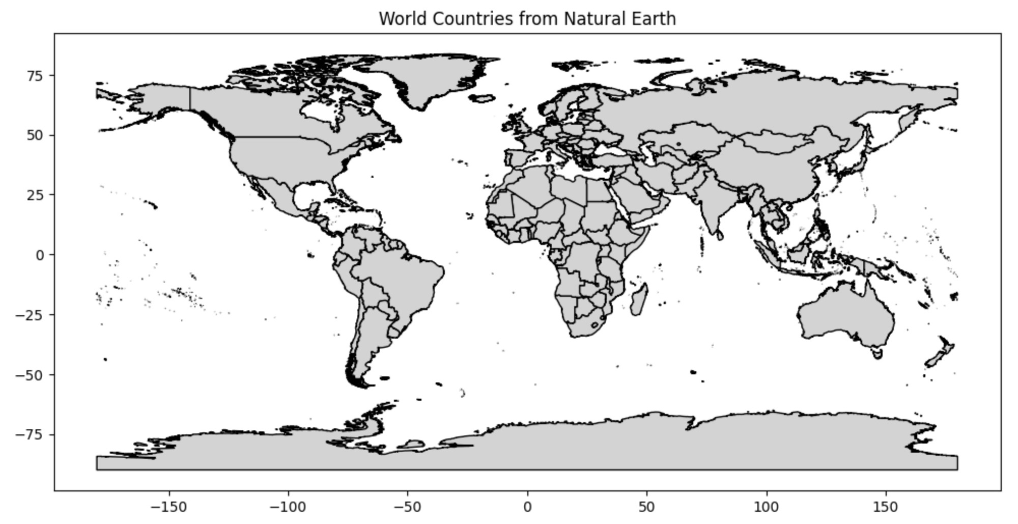
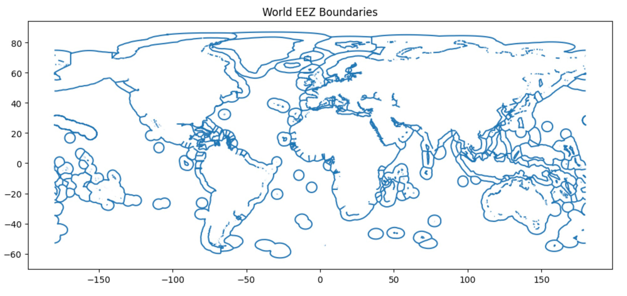
Graph Construction: Country Borders
All experiments use a fixed, unweighted country border graph. Countries are nodes; edges encode geographic adjacency from two public geospatial sources.
Land borders come from Natural Earth Admin 0 – Countries polygons: two countries are connected if their polygons share a land boundary. Sea borders come from the MarineRegions World EEZ v12 dataset: two countries are connected if their EEZ regions touch or overlap, capturing maritime neighbors.
We merge land and sea adjacency into a single undirected graph and label each edge as
land, sea, or both. The topology is not learned;
it is shared across modalities so differences in embeddings reflect the data, not the graph.
Borders are used as a diagnostic lens, not as ground truth for similarity: they let us test how different modalities align with adjacency once embedded in a shared space.
Land borders: Natural Earth. "Admin 0 - Countries." Version 5.0.1, Natural Earth, 2023. https://www.naturalearthdata.com
Sea boundaries: Marineregions.org. (2023). World EEZ v12 [Dataset]. Version 12. https://www.marineregions.org/.
We evaluate link prediction with AUC (Area Under the ROC Curve), which summarizes how well the model separates true border edges from non-edges across thresholds. For the text modality, we obtain AUC = 0.9202, suggesting that Factbook narratives align strongly with geographic adjacency once translated into relationship-aware embeddings.
Text Modality: CIA Factbook
We combine two CIA World Factbook fields—Background and Geography—into one document per country and embed it with all-MiniLM-L6-v2 (384-dim).
Using these vectors as node features, we train a GraphSAGE link-prediction model on the border graph and take the pre-final 64-dim embeddings as Factbook vectors (text representations shaped by geographic adjacency).
Link prediction achieves AUC = 0.9202, indicating strong alignment between Factbook narratives and border structure.
Time-Series Modality: World Bank Indicators
To capture change over time, we use three World Bank WDI indicators and treat each one as a separate channel, so we can compare how different numeric signals behave on the same border graph.
Indicators used:
- Life Expectancy (1960–2022)
- GDP per Capita (1960–2023)
- Internet Usage (1990–2023)
For each country, each indicator is a yearly sequence. We normalize per-indicator, fill missing years via simple time-axis interpolation, and drop countries with excessive missingness. The resulting sequences are used as node features.
We train a separate GraphSAGE link-prediction model for each indicator on the same border graph, then take the pre-final 64-dim embeddings as the indicator-specific vectors (time-series representations shaped by geography).
AUC varies by indicator: Life Expectancy (0.8696), GDP per Capita (0.7817), and Internet Usage (0.8318), reflecting how strongly each signal aligns with border structure once embedded.
Unified Knowledge Graph
Training one model per modality yields four 64-dimensional embeddings per country (Factbook text, GDP, life expectancy, internet usage). Because all models are trained on the same border graph with the same link-prediction objective, these embeddings are directly comparable within a shared coordinate system.
To produce a single “all-in-one” country representation, we fuse the four vectors by concatenating them into a 256-D profile and projecting back down to a compact 64-D embedding. We denote this unified vector as concat64 (also zuni).
Conceptually, this shared 64-D space becomes a machine-readable language for multimodal data: text and time-series signals are mapped into a common representation layer, enabling consistent similarity and relationship analysis across modalities without modality-specific rules.
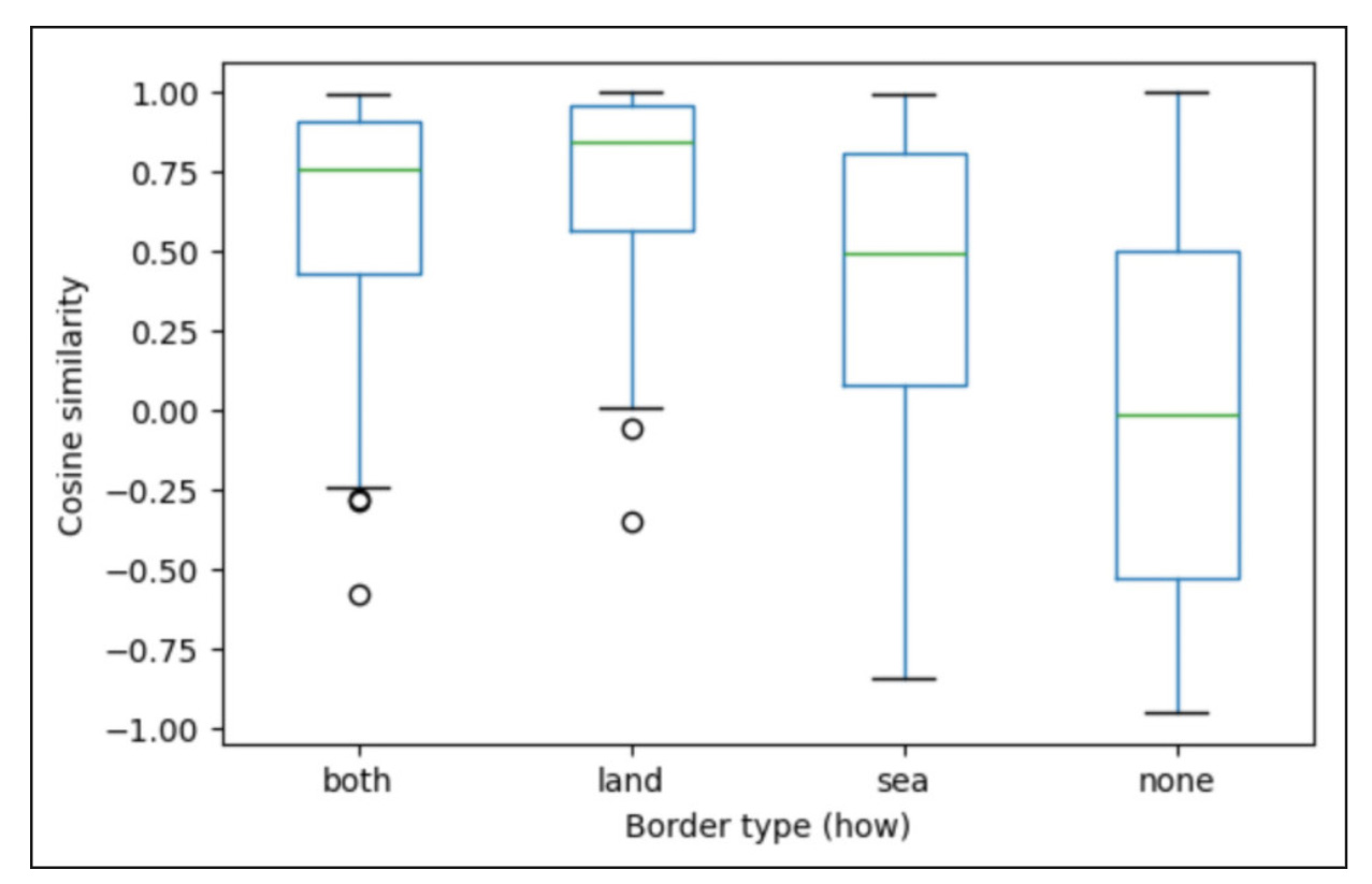
Global Border-Type Structure
We begin by analyzing the unified country embeddings obtained by fusing all modalities
into a single 64-dimensional representation. To test whether geographic structure is preserved in this
unified space, we compute cosine similarity for all country pairs and group the scores by border type:
land, sea, both, and none. This provides a global,
relationship-centric view of how adjacency is reflected after multimodal fusion.
The resulting similarity distributions exhibit a clear and interpretable ordering. Countries sharing
land borders or both land and sea borders are, on average, the most similar.
sea-only neighbors occupy an intermediate regime, while none pairs (no border)
show the greatest variability and lowest central tendency. This pattern indicates that fusion preserves
meaningful geographic signal rather than washing it out.
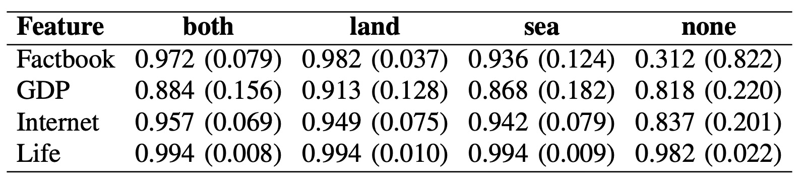
Applying the same border-type analysis to individual modality embeddings reveals substantial differences in how modalities align with geographic structure. Text-based embeddings derived from the CIA Factbook show the strongest separation by border type, suggesting that historical, political, and geographic narratives are tightly coupled to physical proximity. Economic and infrastructure indicators (GDP and Internet usage) display moderate sensitivity, reflecting regional synchronization alongside notable cross-border divergence. In contrast, life expectancy shows minimal dependence on borders, consistent with its globally smooth temporal behavior.
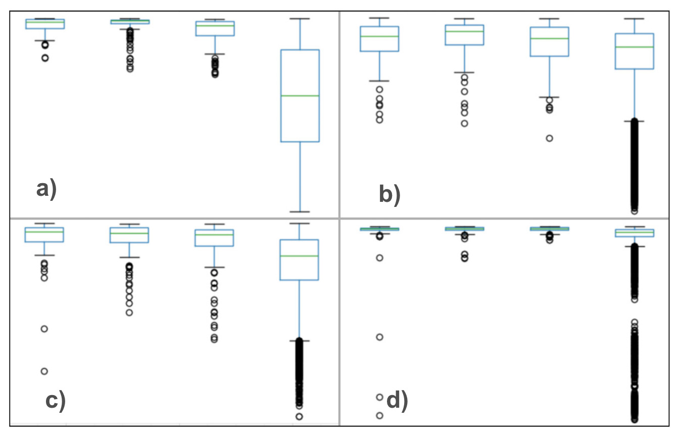
Table below summarizes these trends numerically. Factbook text exhibits the strongest contrast between neighboring and non-neighboring countries, while life expectancy remains nearly invariant across border types. GDP and Internet usage occupy an intermediate regime, confirming that some—but not all—modalities encode geographic structure in a relationship-aware way.
Taken together, these results show that unified embeddings retain interpretable relational structure while still exposing modality-specific differences. Borders are not treated as ground truth for similarity, but as a diagnostic lens that reveals where multimodal representations align with geography—and where they meaningfully diverge.
Relational outliers (pairwise view)
Aggregate plots show the overall trend, but the more interesting stories often live in the exceptions. To make those visible, we look for relational outliers—country pairs whose similarity sharply contradicts geographic expectations.
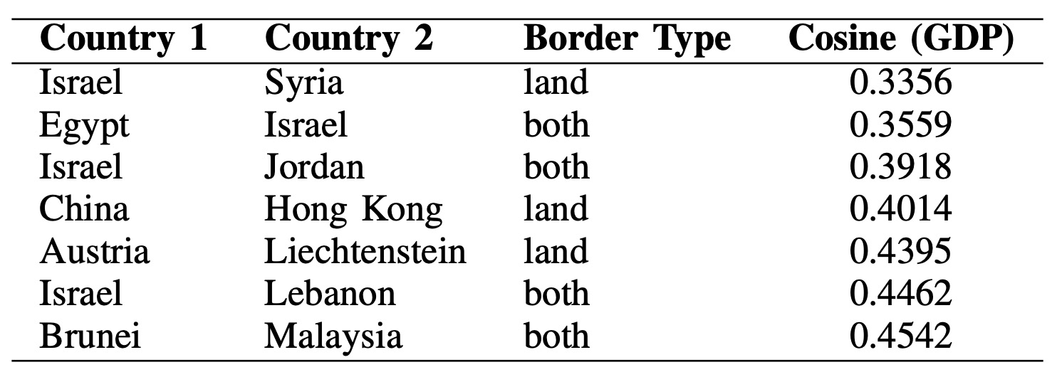
Among dissimilar neighbors (countries connected by land or
both borders), the GDP embedding highlights borders where adjacent countries follow
very different economic paths. The lowest-similarity pairs concentrate around a small set of regions,
especially Israel and its neighbors (Syria, Egypt, Jordan, Lebanon), where structural
divergence dominates despite direct adjacency. Other examples—like China–Hong Kong and
Austria–Liechtenstein—suggest that differences in economic systems or scale effects can
outweigh shared geography.
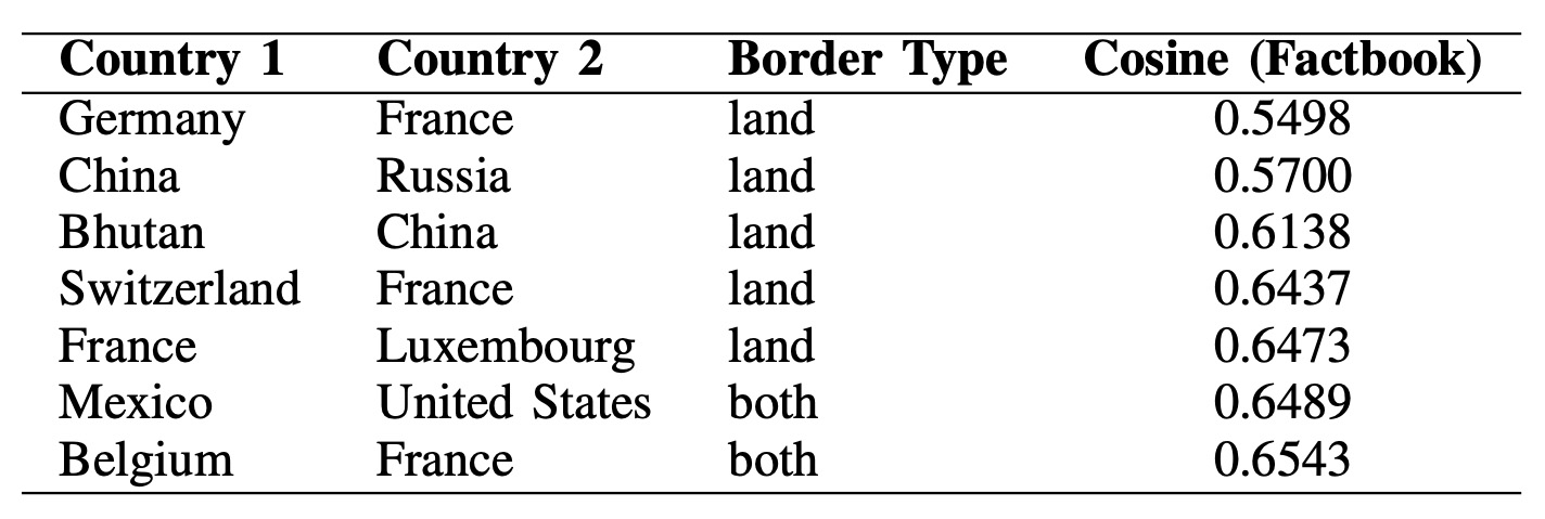
Text-based (Factbook) outliers behave differently. Here, low-similarity neighbor pairs often involve historically and politically prominent countries such as China, France, and the United States. This is consistent with the idea that national narratives (history, governance, geopolitical role) can diverge substantially even across borders, producing textual distance that is not purely geographic.
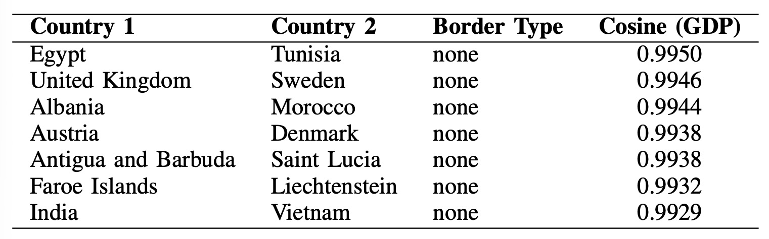
In the opposite direction, similar non-neighbors under GDP embeddings reveal distant pairs with near-identical trajectories. Examples like Egypt–Tunisia and United Kingdom–Sweden point to regional or developmental synchronization, while pairs like Austria–Denmark and India–Vietnam show that modality-specific similarity can emerge independently of proximity.
Taken together, these rankings demonstrate the value of a relationship-aware embedding space: it can preserve geographic structure and surface meaningful deviations—borders where adjacency does not imply similarity, and distant pairs where strong alignment appears unexpectedly.
Country-Centric Neighborhood Diversity
Pairwise outliers are helpful, but a country-centric view asks: does a country look like its
neighborhood on average? For each country, we compute the mean cosine similarity between its
embedding and the embeddings of its neighbors (using land + both edges).
Lower averages indicate a more heterogeneous neighborhood in the embedding space.
Unified embedding (concat64).
The table below highlights countries whose neighborhoods are the most diverse under the fused
multimodal profile. Syria is the strongest outlier, and countries like China, Iraq, and Iran also score low,
suggesting regions where borders connect countries with very different multimodal signatures. This is not
claiming borders imply similarity—rather, it flags where the unified space sees high local variation worth
investigating.
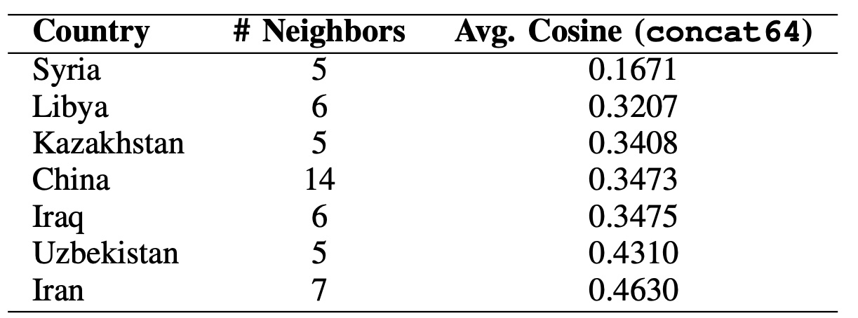
Note: Results are reported only for countries with at least 5 neighbors.
Neighbors are defined using land + both border types. Lower average cosine = greater neighborhood heterogeneity.
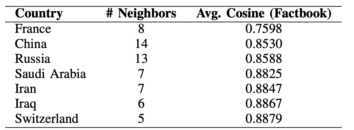
Factbook-only embedding. To see whether these effects are specific to fusion or already present in one modality, we repeat the same metric using the Factbook embeddings. Values are higher overall (text tends to align with borders more strongly), but France, China, and Russia still appear among the lowest averages—suggesting their textual profiles diverge more from nearby neighbors than typical.
Taken together, this country-centric lens complements the global and pairwise analyses by highlighting border regions with systematically diverse neighborhoods—patterns that are hard to see when modalities are analyzed independently.
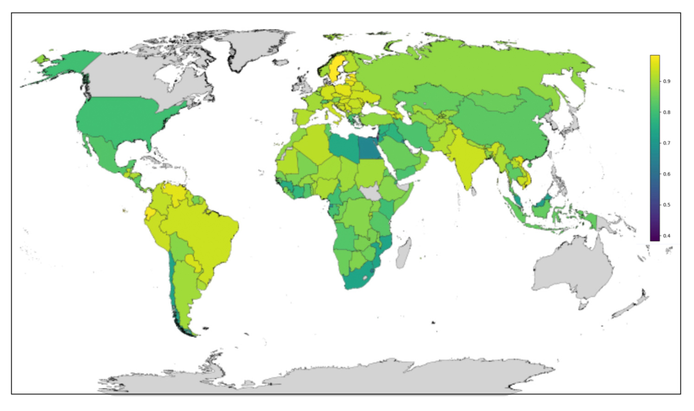
This map shows how similar each country is to its neighbors in the GDP embedding space. Each country is colored by its average cosine similarity to its land and both border neighbors. We compute this statistic only for countries with at least 2 neighbors; countries that do not meet this threshold (or have missing data) are shown in gray.
- Lighter colors indicate countries that are more similar to their neighbors.
- Darker colors indicate countries that are more different from their neighbors.
Note: this is not GDP level. It reflects relationship-aware GDP similarity after embedding.
Conclusion
Unified knowledge graphs are not about storing more data — they are about giving AI systems a shared language for reasoning across text, numbers, and relationships. By using a common relational objective to align heterogeneous modalities, we obtain a single embedding space that is reusable, interpretable, and AI-ready.
While demonstrated here with countries and borders, the same idea applies wherever entities are described by mixed signals and connected by meaningful relationships — from enterprises and products to infrastructure and biological systems. The result is not a single task-specific model, but a stable representation layer that simplifies downstream analytics, retrieval, and reasoning.
The approach assumes an informative relational backbone, and extending it to noisier or weaker graphs is an important next step. But even in its current form, unified knowledge graphs offer a practical path from messy data to coherent, machine-readable understanding.