Spatio-Temporal Graphs for Climate Patterns
Here we combine time series graphs with a global spatial graph of cities to create a spatio-temporal view of climate. Decades of daily temperatures are turned into graph-based climate fingerprints for each city, then injected into a Voronoi-based world graph where neighboring regions share borders. A GNN refines this fused graph so we can see which distant cities behave almost identically, which nearby cities quietly diverge, and which “bridge cities” connect climate regions. The same method can be applied to any setting where signals evolve over time and are anchored in space—sensors, assets, patients, or networks.
Conference
The work “GNN Fusion of Voronoi Spatial Graphs and City–Year Temporal Graphs for Climate Analysis” was presented at SCAI 2025 in Ljubljana, Slovenia, on 8 October 2025. The corresponding paper is currently not yet published in archival proceedings.
Fusing Space & Time with Graph Neural Networks
Climate isn’t only about where you are; it’s about how conditions evolve together across the map. Here we use Graph Neural Networks (GNNs) to connect 1,000 cities across 40 years of daily temperatures, revealing hidden climate “neighborhoods” and long-range “bridges” that geography alone can’t explain. Modeling both space and time as graphs shows when distant regions behave like close neighbors—and when nearby cities drift apart.
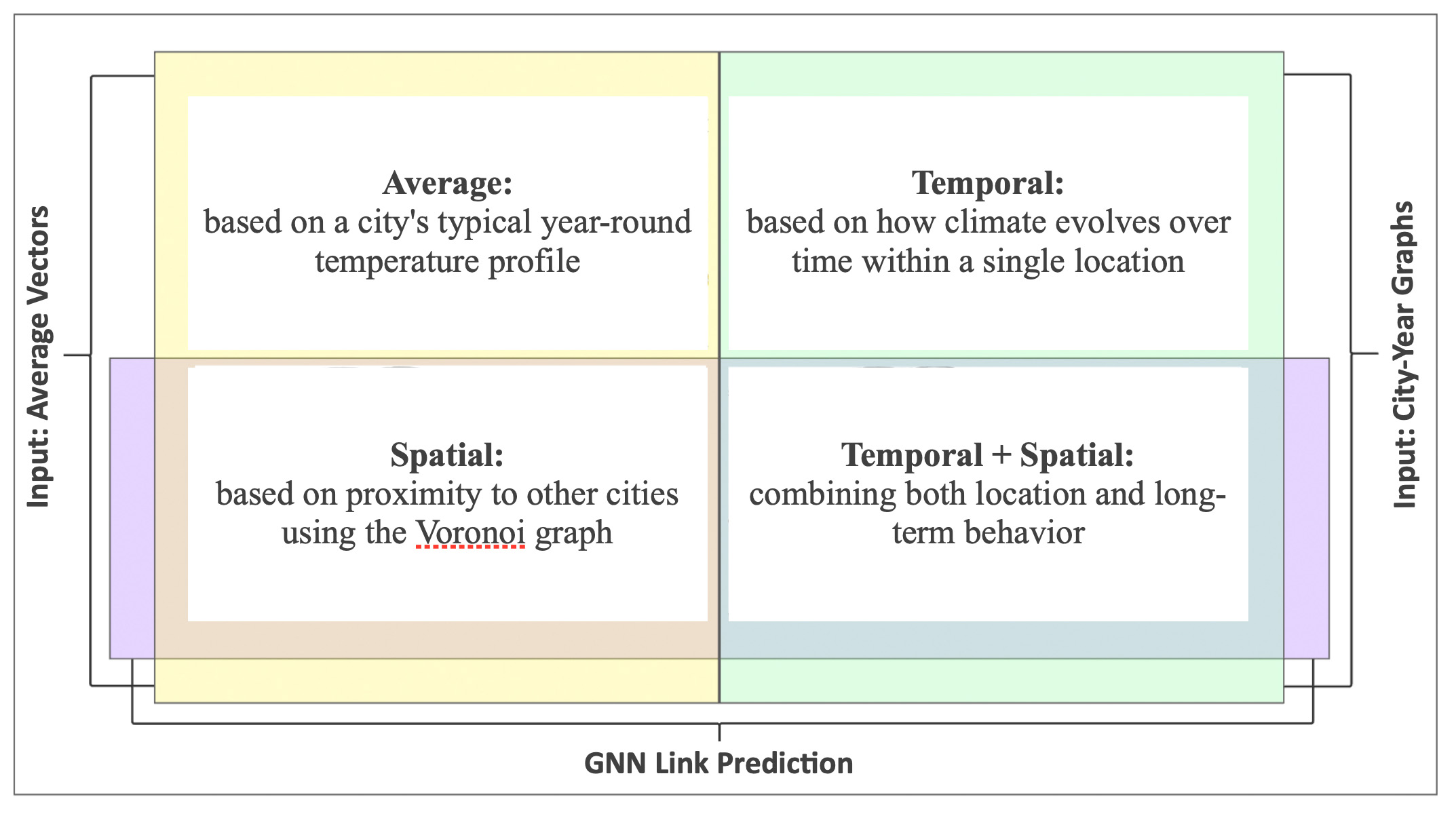
This diagram shows the four different ways we explore climate similarity, based on combinations of input data and graph structures. Here is color guide:
- Yellow area — represents the use of raw data, specifically the average temperature vectors for each city.
- Light green area — represents the use of temporal data, meaning the city-level graphs built from year-to-year climate patterns.
- Purple area — represents the use of spatial data, specifically the Voronoi graph that defines proximity between cities.
Four perspectives we analyze
- Average: a city’s typical year-round temperature profile
- Spatial: proximity connections via a Voronoi graph
- Temporal: how climate evolves across years within one city
- Spatial + Temporal: fusion of both for the richest signal
Why this matters
Most climate work emphasizes either geography or time series. This study fuses both: space (how cities influence one another through adjacency) and time (how each city’s climate changes year to year). The joint view exposes patterns a single axis misses—regional belts that shift together, regime matches across oceans, and nearby microclimates that diverge.
How the model learns similarity
We build two complementary graph families and train GNNs with link prediction to learn embeddings:
- Spatial graphs: nodes are cities; edges come from Voronoi adjacency.
- Temporal city-year graphs: each city becomes a chain of yearly nodes; edges link years with high cosine similarity of their daily temperature vectors.
Feature spaces produced
- Average temperature vectors (365-dim per city)
- City graph embeddings from GNN graph classification over city-year structures
- Link-prediction embeddings (average vectors): predict spatial edges from average profiles
- Link-prediction embeddings (city-graph vectors): same task using city-level GNN vectors, fusing spatial and temporal signals
Reusable blueprint
Although the focus is temperature, this two-stream graph fusion is a reusable approach for evolving systems—mobility, pollution, public health, and more.
Transforming Data to Graphs
Raw Data
This study is based on a large and detailed dataset:- 1,000 the most populous cities worldwide
- Geo-coordinates
- 40 years of daily temperatures (1980–2019)
Spatial Graph -- Voronoi
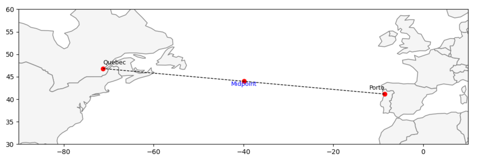
To model geography we use a Voronoi diagram. Think of several coffee shops in a town: each shop “owns” the area closer to it than to any other shop. We apply the same idea to cities. Each city becomes a node; two cities are connected if their Voronoi regions share a boundary. Some neighbors are nearby; others can be surprisingly far apart (see the Québec–Porto example).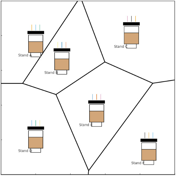
- Coffee shops → areas: each site covers its closest region.
- Neighbors → edges: regions that share a border become connected.
- Cities → nodes: cities sit at Voronoi centers; shared borders define graph edges.
 Because cities are on the curved Earth, we first project latitude/longitude into a planar coordinate system (EPSG:3857) so the Voronoi algorithm—which expects Cartesian coordinates—can run. Any equal, consistent projection is acceptable here; the goal is topological adjacency, not precise distances.
This produces a spatial graph over 1,000 cities in which each node carries a 365-value average-temperature vector (mean daily temperatures across 40 years). The result captures true proximity determined by spatial partitioning—not arbitrary distance thresholds—and highlights dense regional clusters as well as isolated cities.
A spatial graph that connects all 1,000 cities built using a Voronoi diagram, which links cities that are geographically close
Each city is a node, described by a 365-value vector (its average daily temperatures across 40 years)
This gives us a global view of how nearby climates relate
To understand the spatial structure, we used Voronoi diagrams to define natural neighborhoods. Cities are connected if their regions share a border, creating a network that reflects true proximity — not based on arbitrary distance cutoffs, but shaped by how space is divided. This helps capture how some cities are part of dense regional clusters, while others are more isolated.
Because cities are on the curved Earth, we first project latitude/longitude into a planar coordinate system (EPSG:3857) so the Voronoi algorithm—which expects Cartesian coordinates—can run. Any equal, consistent projection is acceptable here; the goal is topological adjacency, not precise distances.
This produces a spatial graph over 1,000 cities in which each node carries a 365-value average-temperature vector (mean daily temperatures across 40 years). The result captures true proximity determined by spatial partitioning—not arbitrary distance thresholds—and highlights dense regional clusters as well as isolated cities.
A spatial graph that connects all 1,000 cities built using a Voronoi diagram, which links cities that are geographically close
Each city is a node, described by a 365-value vector (its average daily temperatures across 40 years)
This gives us a global view of how nearby climates relate
To understand the spatial structure, we used Voronoi diagrams to define natural neighborhoods. Cities are connected if their regions share a border, creating a network that reflects true proximity — not based on arbitrary distance cutoffs, but shaped by how space is divided. This helps capture how some cities are part of dense regional clusters, while others are more isolated.
Temporal City Graphs
We looked at the temporal behavior of climate in each city — how daily temperatures have changed (or remained consistent) across decades. Some locations show highly stable seasonal cycles, while others exhibit more variation year to year. We constructed temporal graphs for each city, with nodes representing city - year, with a 365-value vector of daily temperatures. Graph edges we defined by pairs of nodes with cosine similarities higher than threshold. Temporal graphs represent relationships between daily temperature vectors for different years. For each graph we added a virtual node to transform disconnected graphs into single connected components.- Nodes = city-year; features = daily temperature
- Edges = high cosine similarity (year↔year)
- Virtual nodes to ensure connectivity
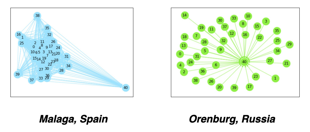 You can see as examples city graph for Malaga, Spain with stable weather and highly similar yearly weather and Orenburg, Russia where daily temperature vectors are very different year by year.
GNN Models
We will use Graph Neural Networks (GNNs) to learn more from these graphs by turning each city (or each city-year) into a meaningful vector. In both cases, the GNN models help us represent each city as a learned vector, shaped by its spatial context or its climate history over time. These new vectors can then be used to compare cities, group them, or detect unusual patterns. From each model, we extract the pre-final output vectors — these are 128-dimensional embeddings that capture the learned information.Temporal GNN - Graph Classification
To capture how each city’s climate has changed over time, we applied a GNN Graph Classification model to 1,000 city-level temporal graphs. The model learns from the structure and connections within each graph, summarizing a city’s long-term climate behavior — whether it’s stable, variable, or somewhere in between. The model requires small graphs with labels. As a simple proxy, we labeled cities based on their distance from the equator, using latitude as an indicator of climate variability. The model outputs a 128-dimensional vector that represents each city’s climate history. Future work could refine these labels with more detailed, data-driven methods. For classifying city graphs, we used the Graph Convolutional Network (GCNConv) model from the PyTorch Geometric Library (PyG). The GCNConv model allowed us to extract feature vectors from the graph data, enabling us to perform a binary classification to determine whether the climate for each city was 'stable' or 'unstable'.Spatial GNN - Link Prediction
For the spatial analysis, we build a Voronoi-based graph that links all 1 000 cities worldwide and train a GNN link-prediction model on it. Each node is initialized with a 365-dimensional “average-temperature” vector, enabling the network to learn how climate patterns propagate among neighboring cities. The model then produces a fresh embedding for every city—one that blends its own climate signature with the influence of its Voronoi neighbors. For spatial graphs we used GNN Link Prediction model based on GraphSAGE algorithm, which generates node embeddings based on attributes and neighbors without retraining. Our study employs a GNN Link Prediction model from the Deep Graph Library (DGL) library.Joint Spatial and Temporal Modeling
To capture both temporal and spatial influences on climate, we apply a GNN Link Prediction model. The graph structure comes from Voronoi-based city connections, while the node features are the learned embeddings from the city-level temporal graphs produced by the GNN Classification model. This allows us to explore how geography and long-term climate behavior interact together.Methods
The diagram below shows how we built a climate similarity model using graph neural networks. First, we connected the 1000 most populated cities using Voronoi-based geography — cities are linked if their zones share a border. Then, we used 40 years of temperature data to describe each city in two ways: one based on raw daily averages, and one using advanced GNN models that learn from how each city's climate changed over time. These feature vectors help us compare cities and uncover deep climate patterns around the world.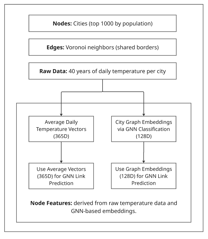 Fig. 1. Overview of the proposed method combining Voronoi-based spatial graphs with GNN pipelines for climate similarity and classification.
Coding and Observations
Data Source: Climate Data
Our primary dataset, sourced from Kaggle, is titled: "Temperature History of 1000 cities 1980 to 2020" - daily temperature from 1980 to 2020 years for 1000 most populous cities in the world. This dataset provides a comprehensive record of average daily temperatures in Celsius for the 1000 most populous cities worldwide, spanning from 1980 to 2019.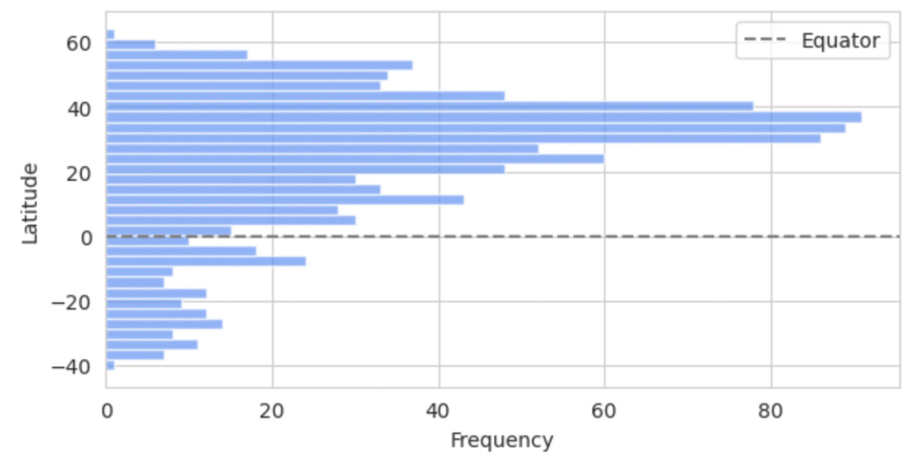 Fig. 1. Latitude Distribution of the 1000 Most Populous Cities.
To begin our climate analysis, we created a simple but effective climate profile for each city. The dataset includes daily temperature readings for 1000 cities across multiple years. By averaging the temperatures for each day of the year across all available years, we produced a single 365-dimensional vector per city.
This average vector captures the city’s typical annual temperature pattern and serves as a foundational node feature for later graph-based models.
Fig. 1. Latitude Distribution of the 1000 Most Populous Cities.
To begin our climate analysis, we created a simple but effective climate profile for each city. The dataset includes daily temperature readings for 1000 cities across multiple years. By averaging the temperatures for each day of the year across all available years, we produced a single 365-dimensional vector per city.
This average vector captures the city’s typical annual temperature pattern and serves as a foundational node feature for later graph-based models.
  df=rawData
  daily_cols = list(map(str, range(365)))
  city_avg_vectors = df.groupby('cityInd')[daily_cols].mean().reset_index()
  city_avg_vectors.shape
  (1000, 366)
Voronoi Graph Construction
To capture spatial relationships between cities, we built a Voronoi diagram, which naturally defines neighboring regions based on geographic proximity.
First, we projected the latitude and longitude of each city into a flat 2D coordinate system using the EPSG:3857 map projection, as required by the Voronoi algorithm.
from pyproj import Transformer
from scipy.spatial import Voronoi
import numpy as np

# Project geographic coordinates to 2D plane
transformer = Transformer.from_crs("epsg:4326", "epsg:3857", always_xy=True)
projected = np.array([
    transformer.transform(lon, lat)
    for lon, lat in zip(cityData['lng'], cityData['lat'])
])
We then computed the Voronoi diagram using SciPy:
# Compute Voronoi diagram
vor = Voronoi(projected)
The Voronoi output contains pairs of neighboring points via vor.ridge_points, which lists index pairs for cities whose regions share a border. We converted these indices into our unique city identifiers (cityInd) and created a DataFrame representing the edge list of our spatial graph:
# Extract unique neighbor pairs
neighbors = set(tuple(sorted((p1, p2))) for p1, p2 in vor.ridge_points)

# Build edge list DataFrame
rows = []
for i, j in neighbors:
    rows.append({
        'city1': cityData.iloc[i]['cityInd'],
        'city2': cityData.iloc[j]['cityInd'],
    })
voronoi_df = pd.DataFrame(rows)
Example of Voronoi-based neighboring city pairs:
| City_1 | City_2 |
|---|---|
| 155 | 810 |
| 60 | 801 |
| 40 | 185 |
| 874 | 905 |
| 686 | 705 |
This edge list defines the connections in our spatial graph, showing which cities are considered neighbors based on shared Voronoi borders.
Calculating Distances Between Neighboring Cities
To measure distances between neighboring cities, we used the same 2D projected coordinates:
rows = []
for i, j in neighbors:
    dist_km = round(np.linalg.norm(projected[i] - projected[j]) / 1000, 5)
    rows.append({
        'city1': cityData.iloc[i]['cityInd'],
        'city2': cityData.iloc[j]['cityInd'],
        'distance_km': dist_km
    })
voronoi_distances_df = pd.DataFrame(rows)
To make the results more readable, we combined city names and countries:
# Create readable city labels
cityData['city_country'] = cityData['city_ascii'] + ', ' + cityData['country']
city_lookup = cityData.set_index('cityInd')['city_country']

# Add city names to distances DataFrame
voronoi_distances_df['city1_name'] = voronoi_distances_df['city1'].map(city_lookup)
voronoi_distances_df['city2_name'] = voronoi_distances_df['city2'].map(city_lookup)
Statistics on distance Between Neighboring Cities (in kilometers)
count     2983.00
mean       638.67
std       1170.90
min          2.27
25%        176.22
50%        340.92
75%        658.97
max      25870.97
This structure provides both the graph topology (neighbors) and distance information, forming the basis for spatial climate analysis using graph models.
Temporal GNN: Graph Classification
For our analysis, each city was modeled as a graph, with nodes representing specific {city, year} pairs. These nodes encapsulate a full year of daily temperature values, allowing us to examine long-term temporal trends across time. To enable classification, each city graph was labeled as either stable or unstable, based on its geographic latitude. The assumption here is that cities located closer to the equator tend to have more stable climate patterns, with less seasonal fluctuation, while those farther from the equator generally experience greater variability.
We divided the cities into two groups using their latitude values—one closer to the equator, the other at higher latitudes—creating a binary classification task for our Graph Neural Network (GNN) model. The bar chart below shows the latitude distribution of all 1000 cities, highlighting a dense cluster between 20\textdegree{} and 60\textdegree{} in the Northern Hemisphere and a sparser spread in the Southern Hemisphere. The equator is marked by a dashed line for reference.
Input Graph Data Preparation
Before training our GNN for classification, we need to label each city graph as either stable or unstable in terms of climate. To do this, we sort all 1000 cities by their absolute latitude — under the assumption that cities closer to the equator (low latitude) tend to have more stable temperature patterns over time.
We assign a label of 0 to the 500 cities nearest the equator and a label of 1 to the 500 cities farther away. These labels serve as ground truth for training the graph classification model.
Here’s the code used to sort the data and assign the classification labels:
df_sorted = df.loc[df['lat'].abs().sort_values().index]
df_sorted['label'] = [0 if i < 500 else 1 for i in range(1000)]
df_sorted.reset_index(drop=True, inplace=True)
df_sorted['labelIndex'] = df_sorted.index
cityLabels = df_sorted.sort_values('cityInd', ascending=True)
cityLabels.reset_index(drop=True, inplace=True)
min_lat = cityLabels['lat'].min()
max_lat = cityLabels['lat'].max()
print("Minimum Latitude:", min_lat)
print("Maximum Latitude:", max_lat)
Minimum Latitude: -41.3
Maximum Latitude: 64.15
After assigning stability labels to cities, we merge this information with the original temperature dataset. Each city-year pair includes a daily temperature vector (365 values), and we focus on the year 1980 as the representative graph structure for every city.
We also extract important metadata — including city name, coordinates, and region — to keep track of each graph’s identity during analysis.
subData=rawData.merge(lineScore,on='cityInd',how='inner')
subData.reset_index(drop=True, inplace=True)
values1=subData.iloc[:, 9:374]
metaGroups=subData[(subData['nextYear']==1980)].iloc[:,[1,2,3,4,7,374]]
metaGroups.reset_index(drop=True, inplace=True)
metaGroups['index']=metaGroups.index
To build graphs for each city, we first define a cosine similarity threshold. We will use this threshold to determine which years within a city are connected based on the similarity of their temperature profiles.
For example, if two years have a cosine similarity greater than 0.925, we connect them with an edge in that city’s graph. This approach helps us capture internal climate consistency and variability over time.
from torch_geometric.loader import DataLoader
import random
datasetTest=list()
cosList = [0.925]
from torch_geometric.loader import DataLoader
datasetTest=list()
datasetModel=list()
import random
for cos in cosList:
for g in range(1000):
cityName=metaGroups.iloc[g]['city_ascii']
country=metaGroups.iloc[g]['country']
label=metaGroups.iloc[g]['label']
cityInd=metaGroups.iloc[g]['cityInd']
data1=subData[(subData['cityInd']==cityInd)]
values1=data1.iloc[:, 9:374]
fXValues1= values1.fillna(0).values.astype(float)
fXValuesPT1=torch.from_numpy(fXValues1)
fXValuesPT1avg=torch.mean(fXValuesPT1,dim=0).view(1,-1)
fXValuesPT1union=torch.cat((fXValuesPT1,fXValuesPT1avg),dim=0)
cosine_scores1 = pytorch_cos_sim(fXValuesPT1, fXValuesPT1)
cosPairs1=[]
score0=cosine_scores1[0][0].detach().numpy()
for i in range(40):
year1=data1.iloc[i]['nextYear']
cosPairs1.append({'cos':score0, 'cityName':cityName, 'country':country,'label':label,
'k1':i, 'k2':40, 'year1':year1, 'year2':'XXX',
'score': score0})
for j in range(40):
if i<j:
score=cosine_scores1[i][j].detach().numpy()
# print(cos)
if score>cos:
year2=data1.iloc[j]['nextYear']
cosPairs1.append({'cos':cos, 'cityName':cityName, 'country':country,'label':label,
'k1':i, 'k2':j, 'year1':year1, 'year2':year2,
'score': score})
dfCosPairs1=pd.DataFrame(cosPairs1)
edge1=torch.tensor(dfCosPairs1[['k1', 'k2']].T.values)
dataset1 = Data(edge_index=edge1)
dataset1.y=torch.tensor([label])
dataset1.x=fXValuesPT1union
datasetTest.append(dataset1)
if label>=0:
datasetModel.append(dataset1)
loader = DataLoader(datasetTest, batch_size=32)
loader = DataLoader(datasetModel, batch_size=32)GNN Graph Classification Model Training
Once our graph dataset is ready, we divide it into training and testing splits — using 888 city graphs for training and the remaining 112 for testing. Each graph represents one city, with nodes representing years and features capturing daily temperature patterns.
We use PyTorch Geometric’s DataLoader to batch graphs efficiently and iterate through them during training. Below, we also define a 3-layer Graph Convolutional Network (GCN) with a global pooling layer that summarizes each graph into a single embedding.
The final layer outputs a prediction for each graph: whether it represents a stable or unstable climate pattern.
torch.manual_seed(12345)
train_dataset =  dataset[:888]
test_dataset = dataset[888:]
rom torch_geometric.loader import DataLoader
train_loader = DataLoader(train_dataset, batch_size=64, shuffle=True)
test_loader = DataLoader(test_dataset, batch_size=64, shuffle=False)
for step, data in enumerate(train_loader):
    print(f'Step {step + 1}:')
    print('=======')
    print(f'Number of graphs in the current batch: {data.num_graphs}')
    print(data)
    print()
from torch.nn import Linear
import torch.nn.functional as F
from torch_geometric.nn import GCNConv
from torch_geometric.nn import global_mean_pool
class GCN(torch.nn.Module):
    def __init__(self, hidden_channels):
        super(GCN, self).__init__()
        torch.manual_seed(12345)
        self.conv1 = GCNConv(365, hidden_channels)
        self.conv2 = GCNConv(hidden_channels, hidden_channels)
        self.conv3 = GCNConv(hidden_channels, hidden_channels)
        self.lin = Linear(hidden_channels, 2)
    def forward(self, x, edge_index, batch, return_graph_embedding=False):
        # Node Embedding Steps
        x = self.conv1(x, edge_index)
        x = x.relu()
        x = self.conv2(x, edge_index)
        x = x.relu()
        x = self.conv3(x, edge_index)
        graph_embedding = global_mean_pool(x, batch)
        if return_graph_embedding:
            return graph_embedding
        x = F.dropout(graph_embedding, p=0.5, training=self.training)
        x = self.lin(x)
        return x
model = GCN(hidden_channels=128)
With the model and data loaders set up, we now train our Graph Neural Network (GCN) using a standard cross-entropy loss function. We optimize using Adam and evaluate the model’s accuracy on both training and test sets after each epoch.
The training loop runs for 76 epochs, showing how well the model is learning to classify cities based on their climate patterns over time.
from IPython.display import Javascript
model = GCN(hidden_channels=128)
optimizer = torch.optim.Adam(model.parameters(), lr=0.01)
criterion = torch.nn.CrossEntropyLoss()
def train():
    model.train()
    for data in train_loader:
         out = model(data.x.float(), data.edge_index, data.batch)
         loss = criterion(out, data.y)
         loss.backward()
         optimizer.step()
         optimizer.zero_grad()
def test(loader):
     model.eval()
     correct = 0
     for data in loader:
         out = model(data.x.float(), data.edge_index, data.batch)
         pred = out.argmax(dim=1)
         correct += int((pred == data.y).sum())
     return correct / len(loader.dataset)
for epoch in range(1, 77):
    train()
    train_acc = test(train_loader)
    test_acc = test(test_loader)
    print(f'Epoch: {epoch:03d}, Train Acc: {train_acc:.4f}, Test Acc: {test_acc:.4f}')
Epoch: 061, Train Acc: 0.9110, Test Acc: 0.8750 Epoch: 062, Train Acc: 0.9392, Test Acc: 0.9107 Epoch: 063, Train Acc: 0.9291, Test Acc: 0.8839 Epoch: 064, Train Acc: 0.9110, Test Acc: 0.9196 Epoch: 065, Train Acc: 0.9471, Test Acc: 0.9107 Epoch: 066, Train Acc: 0.9448, Test Acc: 0.9286 Epoch: 067, Train Acc: 0.9279, Test Acc: 0.8929 Epoch: 068, Train Acc: 0.9392, Test Acc: 0.9107 Epoch: 069, Train Acc: 0.9032, Test Acc: 0.8661 Epoch: 070, Train Acc: 0.9414, Test Acc: 0.9286 Epoch: 071, Train Acc: 0.9426, Test Acc: 0.9018 Epoch: 072, Train Acc: 0.9448, Test Acc: 0.9196 Epoch: 073, Train Acc: 0.9448, Test Acc: 0.9107 Epoch: 074, Train Acc: 0.9448, Test Acc: 0.9107 Epoch: 075, Train Acc: 0.9448, Test Acc: 0.9196 Epoch: 076, Train Acc: 0.9414, Test Acc: 0.9196
Epoch: 076, Train Acc: 0.9414, Test Acc: 0.9196GNN Graph Classification Model Results
Once the model is trained, we can use it to extract vector representations (embeddings) for each city graph. These embeddings capture structural and feature-based patterns learned during training — essentially summarizing each city’s climate behavior over time.
Below, we retrieve the graph embedding for the first city in our dataset. The model outputs a 128-dimensional vector that can later be used for clustering, similarity analysis, or further graph-based tasks.
g=0
out = model(dataset[g].x.float(), dataset[g].edge_index, dataset[g].batch, return_graph_embedding=True)
out.shape
torch.Size([1, 128])
After training our GNN classifier, we loop through all 1000 city graphs and extract their 128-dimensional embeddings using the model’s return_graph_embedding=True mode. These embeddings capture the climate structure of each city graph and can be used for downstream tasks such as clustering, similarity analysis, or building meta-graphs.
We collect these vectors into a unified DataFrame called city_graph_vectors, where each row corresponds to a single city (indexed by cityInd) and each column holds part of its graph embedding.
softmax = torch.nn.Softmax(dim = 1)
graphUnion=[]
for g in range(graphCount):
  label=dataset[g].y[0].detach().numpy()
  out = model(dataset[g].x.float(), dataset[g].edge_index, dataset[g].batch, return_graph_embedding=True)
  output = softmax(out)[0].detach().numpy()
  pred = out.argmax(dim=1).detach().numpy()
  graphUnion.append({'index':g,'vector': out.detach().numpy()})
df=graphUnion_df
df['vector'] = df['vector'].apply(lambda x: np.array(x).flatten())
city_graph_vectors = pd.DataFrame(df['vector'].to_list())
city_graph_vectors.insert(0, 'cityInd', df['index'])
city_graph_vectors.columns = ['cityInd'] + list(range(city_graph_vectors.shape[1] - 1))
Spatial GNN: Link Prediction
We used the GNN Link Prediction model from DGL library for Voronoi graph with average vectors and Voronoi graph with city-graph embedding vectors.
We build a DGL graph where each node represents a city and edges connect Voronoi neighbors. Node features are provided in two forms:
- Raw vectors: 365-dimensional averages of daily temperature over 40 years.
- Embedded vectors: Learned representations from city-level temporal graphs via a GNN classification model.
Graph construction steps (same for both feature types):
- Load vector data and remove non-feature columns (e.g.,
cityInd). - Convert Voronoi-based city pairs to PyTorch edge tensors.
- Create the DGL graph with nodes and Voronoi edges.
- Assign raw or embedded vectors as node features.
avg_vectors=pd.read_csv(theAvgPath)
import torch
import dgl
features = torch.tensor(avg_vectors.drop(columns='cityInd').values, dtype=torch.float32)
src_nodes = torch.tensor(edges['city1'].values, dtype=torch.int64)
dst_nodes = torch.tensor(edges['city2'].values, dtype=torch.int64)
g = dgl.graph((src_nodes, dst_nodes), num_nodes=features.shape[0])
g.ndata['feat'] = features
g
Graph(num_nodes=1000, num_edges=2983,
      ndata_schemes={'feat': Scheme(shape=(365,), dtype=torch.float32)}
      edata_schemes={})
Splitting Edges for Training and Testing
For link prediction, we need both real (positive) and fake (negative) edges. We split Voronoi edges into training and test sets, then sample an equal number of non-connected city pairs as negatives.
- Extract and shuffle city-to-city edges; convert to PyTorch tensors.
- Split 90% for training, 10% for testing.
- Build a sparse adjacency matrix to detect missing (negative) edges.
- Sample negative edges with no connection or self-loop, matching positive count.
import scipy.sparse as sp
import numpy as np
import torch
eids = np.random.permutation(g.number_of_edges())
eids = torch.tensor(eids, dtype=torch.int64)
test_size = int(len(eids) * 0.1)
train_size = len(eids) - test_size
test_pos_u, test_pos_v = u[eids[:test_size]], v[eids[:test_size]]
train_pos_u, train_pos_v = u[eids[test_size:]], v[eids[test_size:]]
adj = sp.coo_matrix((np.ones(len(u)), (u.tolist(), v.tolist())),
      shape=(g.number_of_nodes(), g.number_of_nodes()))
adj_neg = 1 - adj.todense() - np.eye(g.number_of_nodes())
neg_u, neg_v = np.where(adj_neg != 0)
neg_eids = np.random.choice(len(neg_u), g.number_of_edges(), replace=False)
test_neg_u, test_neg_v = neg_u[neg_eids[:test_size]], neg_v[neg_eids[:test_size]]
train_neg_u, train_neg_v = neg_u[neg_eids[test_size:]], neg_v[neg_eids[test_size:]]
train_g = dgl.remove_edges(g, eids[:test_size])
Building a GraphSAGE Model
To learn meaningful representations of each city in our graph, we use a two-layer GraphSAGE model. GraphSAGE (Graph Sample and Aggregate) is a popular Graph Neural Network architecture that generates node embeddings by aggregating information from a node’s neighbors.
In our model, each layer applies a mean aggregator to combine neighbor features and passes the result through a ReLU activation. The second layer refines the hidden representation.
Here’s the code that defines the GraphSAGE model using DGL’s built-in SAGEConv layer:
from dgl.nn import SAGEConv

class GraphSAGE(nn.Module):
    def __init__(self, in_feats, h_feats):
        super(GraphSAGE, self).__init__()
        self.conv1 = SAGEConv(in_feats, h_feats, 'mean')
        self.conv2 = SAGEConv(h_feats, h_feats, 'mean')

    def forward(self, g, in_feat):
        h = self.conv1(g, in_feat)
        h = F.relu(h)
        h = self.conv2(g, h)
        return h
Link Prediction: Dot Product and MLP
To predict whether two cities should be connected, we use link prediction methods that score the similarity between node embeddings.
DotPredictor uses a simple dot product to measure alignment between nodes, while MLPPredictor applies a small neural network to learn more flexible scoring patterns.
import dgl.function as fn
class DotPredictor(nn.Module):
    def forward(self, g, h):
        with g.local_scope():
            g.ndata['h'] = h
            g.apply_edges(fn.u_dot_v('h', 'h', 'score'))
            return g.edata['score'][:, 0]
class MLPPredictor(nn.Module):
    def __init__(self, h_feats):
        super().__init__()
        self.W1 = nn.Linear(h_feats * 2, h_feats)
        self.W2 = nn.Linear(h_feats, 1)
    def apply_edges(self, edges):
        h = torch.cat([edges.src['h'], edges.dst['h']], 1)
        return {'score': self.W2(F.relu(self.W1(h))).squeeze(1)}
    def forward(self, g, h):
        with g.local_scope():
            g.ndata['h'] = h
            g.apply_edges(self.apply_edges)
            return g.edata['score']
Model Setup and Evaluation
We define the full training pipeline using our GraphSAGE model and a predictor. You can easily switch between DotPredictor and MLPPredictor by updating one line.
The compute_loss function uses binary cross-entropy to learn from both positive and negative edges. We also use the AUC (Area Under the Curve) score to evaluate how well the model distinguishes between real and false edges.
model = GraphSAGE(train_g.ndata['feat'].shape[1], 128)
pred = DotPredictor()
def compute_loss(pos_score, neg_score):
    scores = torch.cat([pos_score, neg_score])
    labels = torch.cat([torch.ones(pos_score.shape[0]), torch.zeros(neg_score.shape[0])])
    return F.binary_cross_entropy_with_logits(scores, labels)
def compute_auc(pos_score, neg_score):
    scores = torch.cat([pos_score, neg_score]).numpy()
    labels = torch.cat(
        [torch.ones(pos_score.shape[0]), torch.zeros(neg_score.shape[0])]).numpy()
    return roc_auc_score(labels, scores)
Training the Model
We optimize both the GraphSAGE encoder and the link predictor using the Adam optimizer. During each training epoch, the model generates node embeddings, computes scores for positive and negative edges, and updates its weights using binary cross-entropy loss.
The model is trained for 4000 epochs, with periodic logging of the training loss.
optimizer = torch.optim.Adam(itertools.chain(model.parameters(), pred.parameters()), lr=1e-4 )
all_logits = []
for e in range(4000):
    h = model(train_g, train_g.ndata['feat'])
    pos_score = pred(train_pos_g, h)
    neg_score = pred(train_neg_g, h)
    loss = compute_loss(pos_score, neg_score)
    optimizer.zero_grad()
    loss.backward()
    optimizer.step()
    if e % 200 == 0:
        print('In epoch {}, loss: {}'.format(e, loss))
Average raw vectors:
In epoch 0, loss: 204028.6875
In epoch 200, loss: 1625.9397
In epoch 400, loss: 558.7700
In epoch 600, loss: 291.7234
In epoch 800, loss: 179.5440
In epoch 1000, loss: 120.3145
In epoch 1200, loss: 84.1568
In epoch 1400, loss: 60.9932
In epoch 1600, loss: 44.9907
In epoch 1800, loss: 34.1410
In epoch 2000, loss: 26.5716
In epoch 2200, loss: 21.0573
In epoch 2400, loss: 16.8369
In epoch 2600, loss: 13.7170
In epoch 2800, loss: 11.2253
In epoch 3000, loss: 9.2902
In epoch 3200, loss: 7.8638
In epoch 3400, loss: 6.7238
In epoch 3600, loss: 5.7895
In epoch 3800, loss: 4.9161
City Graph embedded vectors:
In epoch   0, loss: 9616.3594
In epoch 200, loss:  306.7737
In epoch 400, loss:  121.4521
In epoch 600, loss:   62.3646
In epoch 800, loss:   35.9576
In epoch 1000, loss:  23.0823
In epoch 1200, loss:  16.0522
In epoch 1400, loss:  11.7496
In epoch 1600, loss:   8.9312
In epoch 1800, loss:   7.0417
In epoch 2000, loss:   5.7560
In epoch 2200, loss:   4.7962
In epoch 2400, loss:   4.0738
In epoch 2600, loss:   3.5095
In epoch 2800, loss:   3.0330
In epoch 3000, loss:   2.6442
In epoch 3200, loss:   2.3126
In epoch 3400, loss:   2.0293
In epoch 3600, loss:   1.7847
In epoch 3800, loss:   1.6135
Evaluating the Model
To assess performance, we evaluated the trained link prediction model on a held-out test set using the AUC (Area Under the ROC Curve) metric, which measures the model’s ability to distinguish between actual and non-existent links — higher values indicate better predictive accuracy.
The evaluation was performed using two types of node features:
- Average daily temperature vectors: AUC 0.823015
- City graph embedded vectors: AUC 0.808995
The AUC was computed using the following code:
from sklearn.metrics import roc_auc_score
with torch.no_grad():
    pos_score = pred(test_pos_g, h)
    neg_score = pred(test_neg_g, h)
    print('AUC', compute_auc(pos_score, neg_score))
Extracting Node Embeddings from GNN Link Prediction
Once the GNN Link Prediction model has been trained, we can extract the learned node embeddings — 128-dimensional vectors that capture both climate and geographic context. These embeddings represent how each city relates to its Voronoi-based neighbors in terms of temperature trends and spatial structure.
To make the embeddings easier to analyze and merge with other datasets, we convert them into a DataFrame format and assign each row its corresponding cityInd.
import pandas as pd
import torch
h_numpy = h.detach().numpy()
embedding_table = pd.DataFrame(h_numpy)
embedding_table['cityInd'] = embedding_table.index
Findings
Voronoi Graph Observations
The Biggest Triangle in the Voronoi Graph
This map shows the largest "triangle" formed by neighboring cities in our Voronoi graph.
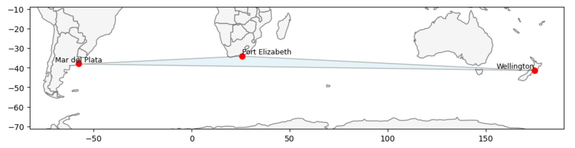
Wellington, New Zealand is one corner of this triangle. Its two nearest neighbors aren’t even nearby — they’re across the ocean in Port Elizabeth, South Africa and Mar del Plata, Argentina.
This triangle highlights how the Voronoi graph connects cities based on available neighbors, not strict distance. In isolated parts of the world, cities can be far apart yet still linked — an effect that’s especially important when exploring global climate patterns.
How Cities Are Distributed in the Voronoi Graph
Through areas of Voronoi diagrams we can see how the world’s 1,000 most populated cities are distributed — and how that shapes our Voronoi graph. The map shows each city as a colored dot, where the color reflects how much space that city covers in the graph. This gives a picture of where cities are packed close together and where they’re more isolated.
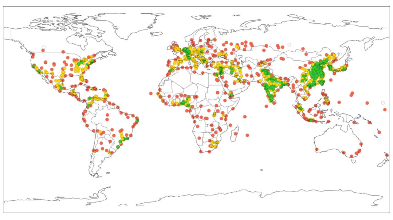
- Green = small cells (dense).
- Yellow = medium.
- Red = large (sparse).
You can see on the map that countries with the highest population —India and China —have large green areas. In Europe it’s interesting to compare Germany and France: similar title population and similar territories, but population distribution by cities are very different.
Populated-city distribution may reflect geography and climate.
Nearby vs. Distant Similarities
The spatial Voronoi graph and the four types of vectors create many opportunities to explore climate patterns across cities. We can look for similarities, differences, clusters, or unexpected relationships. But including all these analyses in one blog post would make it too long and hard to follow.
In this post, we’ll share just a few simple examples to show what’s possible. More detailed results and additional patterns will be covered in separate posts.
The combination of the spatial Voronoi graph and the four types of vectors opens up many ways to explore global climate patterns. There’s an almost endless list of questions we can ask — from obvious ones like which cities have similar climate profiles, to more complex ideas like how geographic structure interacts with long-term climate change.
Distant but similar: Wellington ↔ Mar del Plata (regime match)
The tables below highlight two interesting groups of city pairs based on both their physical distance and climate similarity across different types of vectors.
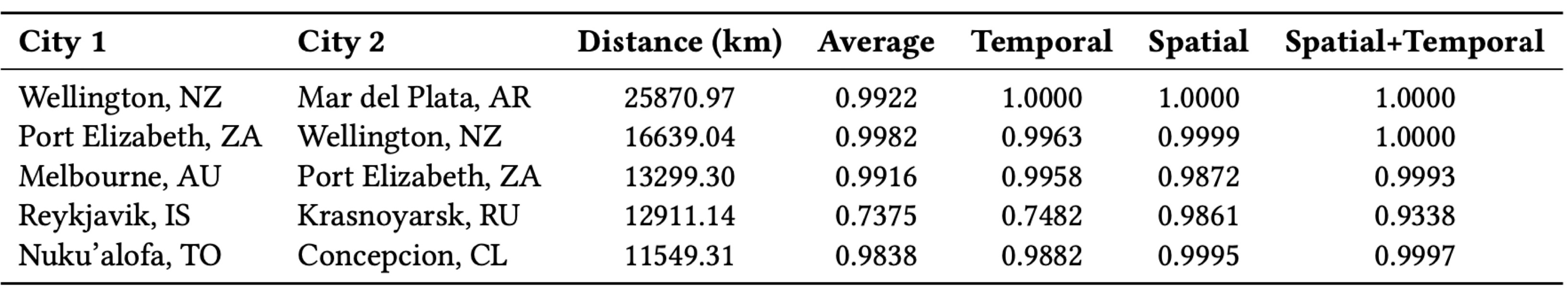
Despite being thousands of kilometers apart, these cities show high climate similarity — especially when considering temporal patterns and spatial relationships together. This suggests that geographic distance alone doesn’t tell the full story when it comes to climate behavior.
Nearby but different: New York ↔ Brooklyn (microclimate)
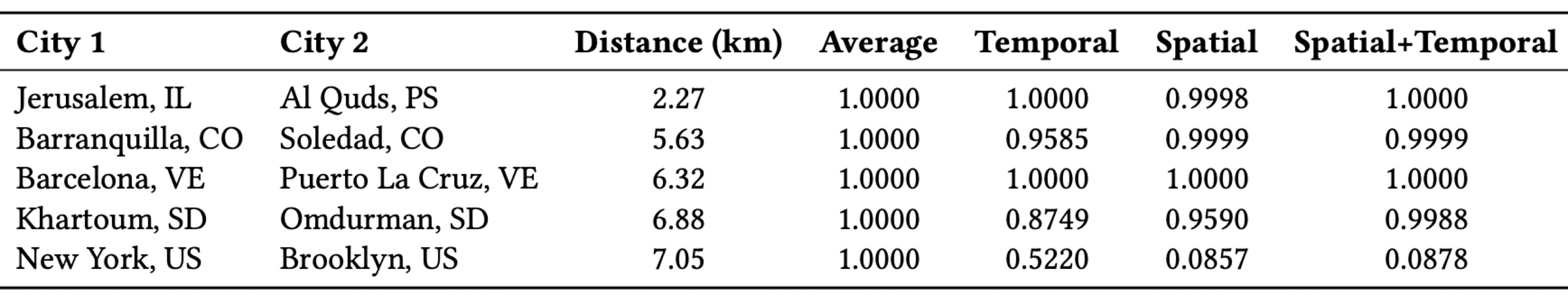
In most cases, neighboring cities naturally share highly similar climates. But there are exceptions — like New York and Brooklyn, where spatial and combined similarity scores are unexpectedly low. This reflects how factors like microclimates, urban environments, or modeling limitations can produce unexpected results, even at small distances.
New Graph Metrics: Closeness and Betweenness
Throughout, climate similarity means cosine similarity between the indicated vectors; for path-based metrics we use edge weights 𝑤 = 1 − cosine. Each set of maps uses the same spatial backbone: edges come from the Voronoi graph, where two cities are adjacent if their cells share a border.
What changes across panels is the edge weight, derived from cosine similarity computed from one of four representations (Average, Temporal, Spatial, Spatial+Temporal), with vectors normalized prior to cosine. The topology stays fixed; the weights—and therefore any shortest- path–based measures—change with the chosen vectors. Smaller weights mean higher climate similarity.
Closeness Centrality
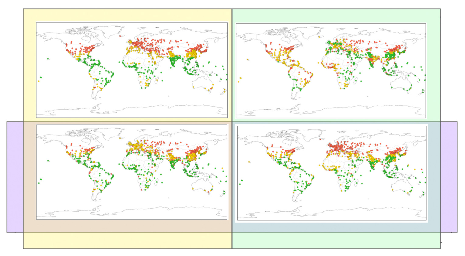
In the closeness centrality maps, cities with high closeness are, on average, at short weighted distance from many others—i.e., they are similar to many cities. Dense climate regions such as Europe and East Asia typically stand out. Differences between panels reveal how each representation defines “similar,” shifting which cities appear most central.
Betweenness Centrality

In the betweenness maps, different weightings emphasize different connectors: high-betweenness cities lie on many shortest routes. The Spatial+Temporal view surfaces more long- range intermediaries than Average (notably in Africa, South America, and the Pacific). We also observe slight polarization in Spatial and Spatial+Temporal; the reason for this requires further research.
To Be Continued...
In future posts, we’ll dig deeper into the questions this approach opens up, like:
- How are cities clustered or isolated in the Voronoi graph — and how does that look across different parts of the world?
- How might those spatial patterns relate to climate stability or change?
- How do different types of vectors — from simple temperature averages to learned embeddings — reveal new climate connections?
- Where do geography and climate patterns align — and where do they tell different stories?
There’s a lot more to explore. These first examples are just a glimpse of how spatial graphs and climate data together can uncover hidden patterns.
Broader Impact
- New perspective: Graph-based AI reveals hidden relationships across space and time — beyond what traditional text or image analyses capture.
- Transferable method: The same fusion pipeline applies to cities, mobility, environmental systems, and public health.
- Next steps — vectors: We showed only a few examples; many more applications and vector analyses remain to explore.
- Next steps — healthcare: Extend the approach to disease-spread modeling and hospital-capacity planning.