Graph-Level Embeddings
Graph-level embeddings are the pre-final vectors produced by a GNN graph classification model, giving one compact fingerprint for each graph—whether it represents a city’s climate, an EEG trial, a machine, or a document. Once we have these embeddings, we can use simple vector-space tools (similarity, clustering, thresholds) to compare graphs, group similar cases, spot outliers, and even build a “graph of graphs” on top of them. In other words, graph-level embeddings turn single GNN predictions into a reusable layer for deeper analysis across many small graphs.
Conference & Poster
This work, “Utilizing Pre-Final Vectors from GNN Graph Classification for Enhanced Climate Analysis”, was presented as a peer-reviewed poster at the 21st International Workshop on Mining and Learning with Graphs (MLG 2024), co-located with ECML-PKDD 2024 in Vilnius, Lithuania, on 9 September 2024. The paper appears in the non-archival online workshop proceedings and is available via the MLG 2024 website.
Introduction
Linear algebra plays a crucial role in machine learning and artificial intelligence by providing efficient ways to represent and manipulate data. Whether dealing with matrices or vectors, these mathematical structures help model complex problems in a manageable form. The rise of deep learning models has shown just how versatile linear algebra can be across various fields. Converting different types of data—like images, audio, text, and social network information—into a uniform vector format is essential for deep learning. This standardization makes it easier for deep learning algorithms to process and analyze data, paving the way for innovative AI applications that work across multiple domains. Linear algebra supports many machine learning methods, including clustering, classification, and regression, by enabling data manipulation and analysis within neural network pipelines. Each step in these pipelines often involves vector operations, highlighting the critical role of linear algebra in advancing deep learning technology. In this post, we explore how to capture pre-final vectors from GNN processes and apply these intermediate vectors to various techniques beyond their primary tasks. GNNs are used for key tasks like node classification, link prediction, and graph classification. Node classification and link prediction rely on node embeddings, while graph classification uses whole graph embeddings. These pre-final vectors, which represent embedded node features, can be utilized for tasks like node classification, regression, clustering, finding closest members, and triangle analysis. For example, the GraphSAGE link prediction model in the Deep Graph Library (DGL) produces pre-final vectors, or embeddings, for each node instead of direct link predictions. These embeddings capture the nodes’ features and relationships within the graph. Previous studies have used these pre-final vectors for tasks like node classification, clustering, regression, and graph triangle analysis. While the potential of pre-final vectors from link prediction models has been studied, our research shows that no studies currently look into capturing embedded whole graphs from GNN Graph Classification models. These models capture graph structures through both individual nodes and overall topology, using both attribute and relational information in small graphs. This makes GNN Graph Classification models powerful for specific challenges in fields like social networks, biological networks, and knowledge graphs. In this study, we will show how to capture embedded vectors of entire 'small graphs' from such models and use them for further graph data analysis. GNN Graph Classification models use many labeled small graphs as input data. Traditionally used in chemistry and biology, these models can also be applied to small graphs from other domains. For instance, in social networks, these techniques analyze the surroundings of points of interest identified by high centrality metrics, including their friends and friends of friends. Time series data can be segmented into small graphs using sliding window techniques, effectively capturing short-term variability and rapid changes for dynamic data analysis. In our study, we will use climate time series data from a Kaggle dataset containing daily temperature data for 40 years in the 1000 most populous cities worldwide. For each city, we will create a graph where nodes represent combinations of cities and years, and node features are daily temperature vectors for each city-year node. To define graph edges, we will select pairs of vectors with cosine similarities higher than a threshold. We will validate the methods for capturing pre-final vectors and demonstrate their effectiveness in managing and analyzing dynamic datasets. By capturing these embedded vectors and applying similarity measures to them, we will extend beyond graph classification to apply methods like clustering, finding the closest neighbors for any graph, or even using small graphs as nodes to create meta-graphs on top of small graphs.Related Work
In 2012, deep learning and knowledge graphs experienced a significant breakthrough. The introduction of Convolutional Neural Network (CNN) image classification through AlexNet demonstrated its superiority over previous machine learning techniques in various domains. Around the same time, Google introduced knowledge graphs, which enabled machines to understand relationships between entities and revolutionized data integration and management, enhancing products with intelligent capabilities. For years, deep learning and knowledge graphs grew simultaneously, with CNNs excelling at tasks involving grid-structured data but struggling with graph-structured data. Conversely, graph techniques thrived on graph-structured data but lacked the sophisticated capabilities of deep learning. In the late 2010s, Graph Neural Networks (GNNs) emerged, combining deep learning with graph processing. This innovation revolutionized the handling of graph-structured data by enabling complex data analysis and predictions through the effective capture of relationships between graph nodes. Starting in 2022, Large Language Models (LLMs) became prominent in the deep learning landscape, capturing much of the research attention. However, the potential of GNNs continues to be recognized, and we remain optimistic that GNN research and applications will continue to grow and expand.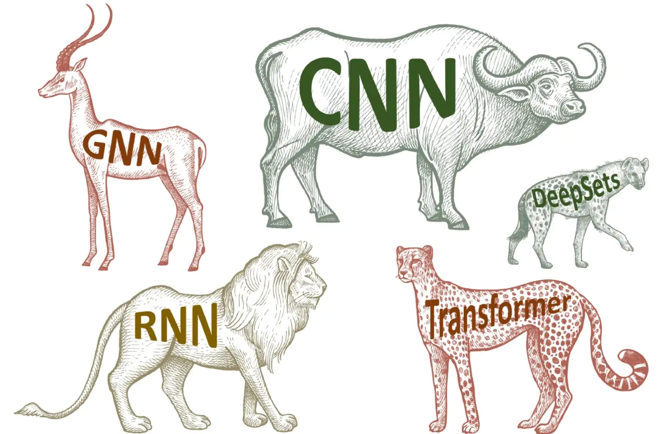 (Picture from a book: Bronstein, M., Bruna, J., Cohen, T., and Velickovic ́, P.
“Geometric deep learning: Grids, groups, graphs, geodesics, and gauges”, 2021)
(Picture from a book: Bronstein, M., Bruna, J., Cohen, T., and Velickovic ́, P.
“Geometric deep learning: Grids, groups, graphs, geodesics, and gauges”, 2021)
The "Geometric Deep Learning" paper was written in 2021 when Convolutional Neural Networks (CNNs) were the leading models in the deep learning world. If that paper were written in 2023-2024, Large Language Models (LLMs) would undoubtedly be at the forefront. It's exciting to think about what might be the biggest breakthrough in deep learning in the next 2-3 years.
Methods
Graph Construction and Climate Labeling
In this study, we utilized GNN Graph Classification models to analyze small labeled graphs created from nodes and edges. We constructed graphs for each city, with nodes representing specific city-year pairs and edges defined by pairs of nodes with cosine similarities higher than threshold values. Each graph was labeled as either 'stable' or 'unstable' based on the city's geographical latitude.Implementation of GCNConv for Graph Classification
For classifying these graphs, we used the Graph Convolutional Network (GCNConv) model from the PyTorch Geometric Library (PyG). The GCNConv model allowed us to extract feature vectors from the graph data, enabling us to perform a binary classification to determine whether the climate for each city was 'stable' or 'unstable'.Python Code for Extracting Pre-Final Vectors: Graph Embedding
This function defines a custom Graph Convolutional Network (GCN) model using the PyTorch Geometric (PyG) library. The model is designed for classifying graphs, such as determining the climate stability of cities based on their temperature data. Here's a detailed breakdown of the function:- Node Embedding:
- Input features are processed through multiple graph convolutional layers.
- ReLU activation is applied to enhance node embeddings.
- Aggregation:
- Node embeddings are pooled into a single graph embedding using global mean pooling.
- This aggregation creates a vector representing the entire graph.
- Returning Graph Embedding:
- If a specific parameter is set, the function returns these graph embeddings as pre-final vectors.
- These intermediate vectors can then be used for further analysis, such as climate data analysis, clustering, or other tasks.
from torch.nn import Linear
import torch.nn.functional as F
from torch_geometric.nn import GCNConv
from torch_geometric.nn import global_mean_pool
class GCN(torch.nn.Module):
    def __init__(self, hidden_channels):
        super(GCN, self).__init__()
        torch.manual_seed(12345)
        self.conv1 = GCNConv(365, hidden_channels)
        self.conv2 = GCNConv(hidden_channels, hidden_channels)
        self.conv3 = GCNConv(hidden_channels, hidden_channels)
        self.lin = Linear(hidden_channels, 2)
    def forward(self, x, edge_index, batch, return_graph_embedding=False):
        # Node Embedding Steps
        x = self.conv1(x, edge_index)
        x = x.relu()
        x = self.conv2(x, edge_index)
        x = x.relu()
        x = self.conv3(x, edge_index)
        # Graph Embedding Step
        graph_embedding = global_mean_pool(x, batch)  # [num_graphs, hidden_channels]
        if return_graph_embedding:
            return graph_embedding  # Return graph-level embedding here
        # Classification Step
        x = F.dropout(graph_embedding, p=0.5, training=self.training)
        x = self.lin(x)
        return x
model = GCN(hidden_channels=128)
print(model)out, capturing the structural and feature information of the entire graph.
g = 0
out = model(dataset[g].x.float(), dataset[g].edge_index, dataset[g].batch, return_graph_embedding=True)
out.shape
torch.Size([1, 128])- dataset[g].x.float(): Node features as floating-point tensor.
- dataset[g].edge_index: Edge list of the graph.
- dataset[g].batch: Batch assignment for nodes.
- return_graph_embedding=True: Requests the graph-level embedding instead of classification.
softmax = torch.nn.Softmax(dim = 1)
graphUnion=[]
for g in range(graphCount):
  label=dataset[g].y[0].detach().numpy()
  out = model(dataset[g].x.float(), dataset[g].edge_index, dataset[g].batch, return_graph_embedding=True)
  output = softmax(out)[0].detach().numpy()
  pred = out.argmax(dim=1).detach().numpy()
graphUnion.append({'index':g,'vector': out.detach().numpy()})import pandas as pd
import torch
from torch.nn.functional import normalize
def cos_sim(a: torch.Tensor, b: torch.Tensor):
if not isinstance(a, torch.Tensor):
a = torch.tensor(a)
if not isinstance(b, torch.Tensor):
b = torch.tensor(b)
if len(a.shape) == 1:
a = a.unsqueeze(0)
if len(b.shape) == 1:
b = b.unsqueeze(0)
a_norm = normalize(a, p=2, dim=1)
b_norm = normalize(b, p=2, dim=1)
return torch.mm(a_norm, b_norm.transpose(0, 1))graphUnion and appends the results, along with their corresponding graph indices, to the cosine_similarities list.
cosine_similarities = []
for i in range(len(graphUnion)):
    for j in range(i+1, len(graphUnion)):
        vector_i = torch.tensor(graphUnion[i]['vector'])
        vector_j = torch.tensor(graphUnion[j]['vector'])
        cos_sim_value = cos_sim(vector_i, vector_j).numpy().flatten()[0]
        cosine_similarities.append({
            'left': graphUnion[i]['index'],
            'right': graphUnion[j]['index'],
            'cos': cos_sim_value
        })
Experiments Overview
Data Source: Climate Data
Our primary dataset, sourced from Kaggle, is titled: "Temperature History of 1000 cities 1980 to 2020" - daily temperature from 1980 to 2020 years for 1000 most populous cities in the world. This dataset provides a comprehensive record of average daily temperatures in Celsius for the 1000 most populous cities worldwide, spanning from 1980 to 2019. Using this extensive dataset, we developed a Graph Neural Network (GNN) Graph Classification model to analyze and interpret the climatic behaviors of these urban centers. For our analysis, each city was represented as an individual graph, with nodes corresponding to specific city-year pairs. These nodes encapsulate the temperature data for their respective years, facilitating a detailed examination of temporal climatic patterns within each city. The graphs were labeled as 'stable' or 'unstable' based on the latitude of the cities. We assumed that cities closer to the equator exhibit less temperature variability and hence more stability. This assumption aligns with observed climatic trends, where equatorial regions generally experience less seasonal variation compared to higher latitudes. To categorize the cities, we divided the 1000 cities into two groups based on their latitude, with one group consisting of cities nearer to the equator and the other group comprising cities at higher latitudes.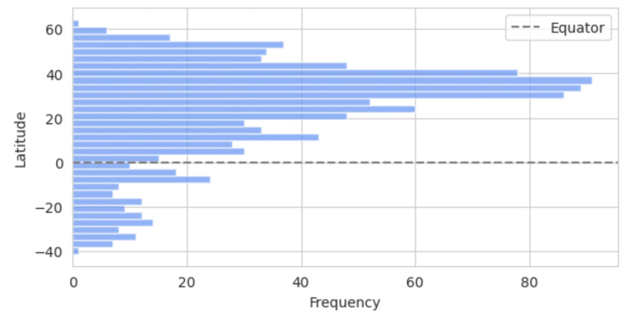 Fig. 1. Latitude Distribution of the 1000 Most Populous Cities.
The bar chart on this picture shows the latitude distribution of the 1000 most populous cities, highlighting a higher concentration of cities in the Northern Hemisphere, particularly between 20 and 60 degrees latitude, with fewer cities in the Southern Hemisphere. The equator is marked by a dashed line.
Fig. 1. Latitude Distribution of the 1000 Most Populous Cities.
The bar chart on this picture shows the latitude distribution of the 1000 most populous cities, highlighting a higher concentration of cities in the Northern Hemisphere, particularly between 20 and 60 degrees latitude, with fewer cities in the Southern Hemisphere. The equator is marked by a dashed line.
Data Preparation and Model Training
In our project, we developed a Graph Neural Network (GNN) Graph Classification model to analyze climate data. We created individual graphs for each city, labeling them as 'stable' or 'unstable' based on their latitude. Edges in these graphs were defined by high cosine similarities between node pairs, indicating similar temperature trends. To ensure consistency across all graphs, we introduced virtual nodes, which improved connectivity and helped the model generalize across different urban climates. For our analysis, we used the GCNConv model from the PyTorch Geometric (PyG) library. This model is excellent for extracting important feature vectors from graphs before making final classification decisions, which are essential for a detailed analysis of climate patterns.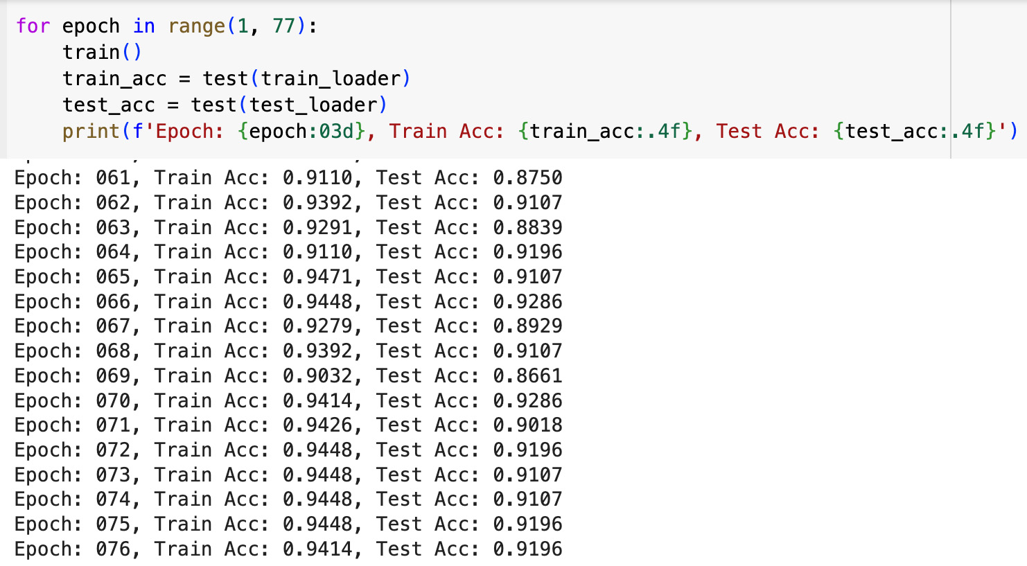 The GCNConv model performed very well, with accuracy rates of around 94% on training data and 92% on test data. These results highlight the model’s ability to effectively detect and classify unusual climate trends using daily temperature data represented in graph form.
Application of Graph Embedded Vectors: Cosine Similarity Analysis
After training the GNN Graph Classification model, we transformed each city graph into an embedded vector. These vectors became the foundation for our subsequent data analyses.Cosine Similarity Matrix Analysis of Graph-Embedded Vectors
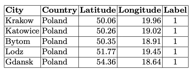
We constructed a cosine similarity matrix for 1000 cities to identify closely related climate profiles. This matrix allows for detailed comparisons and clustering based on the embedded vector data. To illustrate, we examined the closest neighbors of the graph vectors for Tokyo, Japan (the largest city in our dataset), and Gothenburg, Sweden (the smallest city in our dataset). Tokyo’s closest neighbors are primarily major Asian cities, indicating strong climatic and geographical similarities. Similarly, Gothenburg’s nearest neighbors are predominantly European cities, reflecting similar weather patterns across Northern and Central Europe. We also identified vector pairs with the lowest cosine similarity, specifically -0.543011, between Ulaanbaatar, Mongolia, and Shaoguan, China. This negative similarity suggests stark climatic differences. Additionally, the pair with a cosine similarity closest to 0.0 (-0.000047), indicating orthogonality, is between Nanchang, China, and N’Djamena, Chad. This near-zero similarity underscores the lack of a significant relationship between these cities’ climatic attributes. Table 1. Closest Neighbors of Tokyo, Japan (Lat 35.69, Long 139.69). Based on Cosine Similarity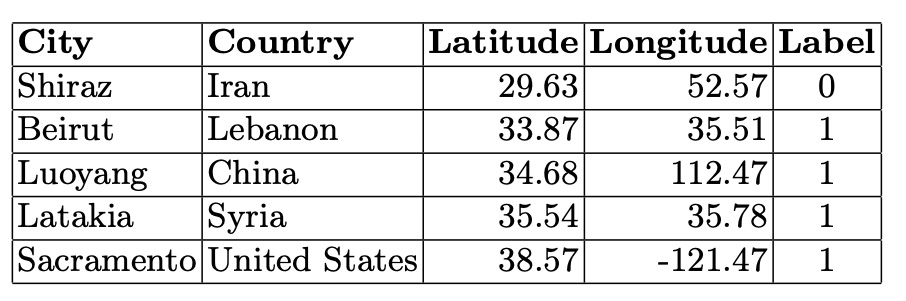 Table 2. Closest Neighbors of Gothenburg, Sweden (Lat 57.71, Long 12.00). Based on Cosine Similarity
 Code to identify the top 5 closest neighbors to a specific node (node 0) based on cosine similarity values:
- Select neighbors where node 0 is either the 'left' or 'right' node from the DataFrame dfCosSim.
- Concatenate these rows into a single DataFrame neighbors.
- Sort the combined DataFrame by cosine similarity in descending order to prioritize the closest neighbors.
- Add a 'neighbor' column to identify the neighboring node, adjusting between 'left' and 'right' as needed.
- Select the top 5 rows with the highest cosine similarity and keep only the 'neighbor' and 'cos' columns.
    neighbors_left = dfCosSim[dfCosSim['left'] == 0]
    neighbors_right = dfCosSim[dfCosSim['right'] == 0]
    neighbors = pd.concat([neighbors_left, neighbors_right])
    neighbors = neighbors.sort_values(by='cos', ascending=False)
    neighbors['neighbor'] = neighbors.apply(lambda row: row['right'] if row['left'] == 0 else row['left'], axis=1)
    top_5_neighbors = neighbors.head(5)
    top_5_neighbors = top_5_neighbors[['neighbor', 'cos']]
Analyzing Climate Profiles with Cosine Similarity Matrix
The cosine similarity matrix distribution from the embedded city graphs reveals distinct clustering patterns, with notable peaks for values over 0.9 and between -0.4 to -0.2. These peaks indicate clusters of cities with nearly identical climates and those with shared but less pronounced features. This skewed distribution highlights areas with the highest concentration of values, providing essential insights into the relational dynamics and clustering patterns of the cities based on their climate data. The bar chart clearly illustrates how cities with similar climate profiles group together. Table 3. Distribution of Cosine Similarities.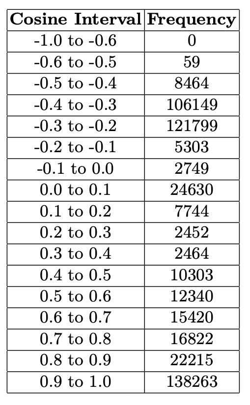
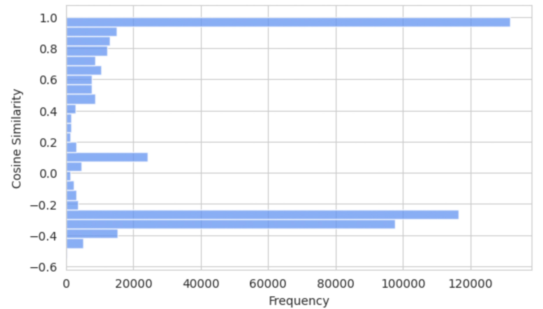 Code for distribution of cosine similarities
import matplotlib.pyplot as plt
plt.figure(figsize=(7, 5))  # Adjust the size of the figure, swapped dimensions for vertical orientation
plt.hist(dfCosSim['cos'], bins=25, alpha=0.75,
         color='CornflowerBlue',
         orientation='horizontal')  # Set orientation to horizontal
plt.title('Distribution of Cosine Similarities')
plt.ylabel('Cosine Similarity')  # Now y-axis is cosine similarity
plt.xlabel('Frequency')  # And x-axis is frequency
plt.grid(True)
plt.show()
Application of Graph Embedded Vectors: Graphs Derived from Cosine Similarity Thresholds
Based on the observed distribution of cosine similarities, we generated three distinct graphs for further analysis, each using different cosine similarity thresholds to explore their impact on city pair distances. To calculate distances between cities we used the following code:from math import sin, cos, sqrt, atan2, radians
def dist(lat1,lon1,lat2,lon2):
rlat1 = radians(float(lat1))
rlon1 = radians(float(lon1))
rlat2 = radians(float(lat2))
rlon2 = radians(float(lon2))
dlon = rlon2 - rlon1
dlat = rlat2 - rlat1
a = sin(dlat / 2)**2 + cos(rlat1) * cos(rlat2) * sin(dlon / 2)**2
c = 2 * atan2(sqrt(a), sqrt(1 - a))
R=6371.0
return R * c
def cityDist(city1,country1,city2,country2):
lat1=cityMetadata[(cityMetadata['city_ascii']==city1)
& (cityMetadata['country']==country1)]['lat']
lat2=cityMetadata[(cityMetadata['city_ascii']==city2)
& (cityMetadata['country']==country2)]['lat']
lon1=cityMetadata[(cityMetadata['city_ascii']==city1)
& (cityMetadata['country']==country1)]['lng']
lon2=cityMetadata[(cityMetadata['city_ascii']==city2)
& (cityMetadata['country']==country2)]['lng']
return dist(lat1,lon1,lat2,lon2) import networkx as nx
import matplotlib.pyplot as plt
df=dfCosSim
high_cos_df = df[df['cos'] > 0.9]
G = nx.Graph()
if not high_cos_df.empty:
for index, row in high_cos_df.iterrows():
G.add_edge(row['left'], row['right'], weight=row['cos'])for _, row in distData.iterrows():
if G.has_edge(row['left'], row['right']):
G[row['left']][row['right']]['distance'] = row['distance']
distances = [attr['distance'] for u, v, attr in G.edges(data=True)]
mean_distance = np.mean(distances)
median_distance = np.median(distances)
std_deviation = np.std(distances)
min_distance = np.min(distances)
max_distance = np.max(distances)- Mean distance: 7942.658 km
- Median distance: 7741.326 km
- Standard deviation: 5129.801 km
- Minimum distance: 1.932 km
- Maximum distance: 19975.287 km
- Mean distance: 8648.245 km
- Median distance: 8409.507 km
- Standard deviation: 4221.592 km
- Minimum distance: 115.137 km
- Maximum distance: 19963.729 km
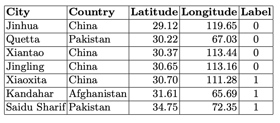 In the smaller connected components, city graphs represent areas on the border between stable and unstable climates. The cities in these smaller components illustrate the variability and complexity of climatic relationships, showing a blend of stable and unstable climatic conditions. This underscores the nuanced and intricate climatic patterns that exist at the boundaries between different climate categories.
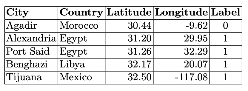
Table 5. Cities in the Fourth Connected Component (5 Nodes)
In the smaller connected components, city graphs represent areas on the border between stable and unstable climates. The cities in these smaller components illustrate the variability and complexity of climatic relationships, showing a blend of stable and unstable climatic conditions. This underscores the nuanced and intricate climatic patterns that exist at the boundaries between different climate categories.
Table 5. Cities in the Fourth Connected Component (5 Nodes)